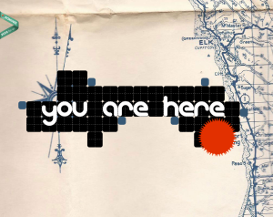
I was immediately attracted to this design because of it’s creative feel. Some of the other websites that I visited were very creative, but also slightly overwhelming. This one clearly features a map in the background that helps the viewer makes sense of the “you are here” graphic. A small critique–the menu did not show up until one scrolls down on the page, and then it is apparent. It was a little confusing at first. But it was also nice that when I did click on one of the menu options, it scrolled down to the section of the screen that corresponded with the menu item. It didn’t open a new page. All of the content is essentially on one really long page. The typeface was also a nice choice to contribute to the creative feel of the website.


This is the site I used – http://www.designersatlas.com/#collaboration
This is a very creative and un ordinary layout for a webpage. I think it works to its advantage that it isnt set up in a more traditional format because it makes you stop and look at the page more to get a better look at how cool and creative it is.