
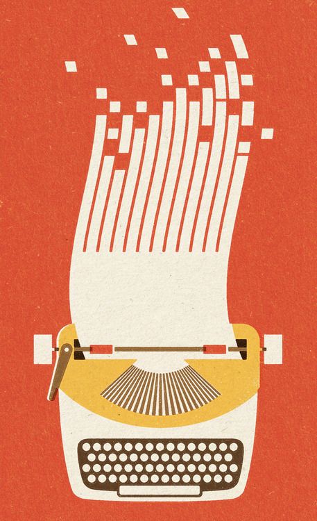
For this illustration, it appears that the illustrator may have scanned in some type of textured paper or used a textured paint fill. For the white keys, the illustrator used the shape tool to create perfect circles (the same technique was probably used for the other basic shapes to create the typewriter). For the splitting paper at the top which morphs into data bits, the artist must have used the curved pen tool. For the slanted squares, the illustrator could’ve transformed the squares by pulling on the corners. I like that it is very minimalist and uses simple geometric shapes to create the illustration.


The designer here used a good combination of the paint tool with the main colors of orange and white. Furthermore, the splitting curved pen tool created the curved paper at the top which initially grabs the viewers attention and illustrates the illusion of the paper coming out of the type writer.
I like that the main colors of this are all textured. It would appear to be kind of like clipart if the colors were just flat. This adds dimension to the picture without even having to add a drop shadow or any sort of coloring to indicate dimension. I also like the color family that the artist stuck with. The warm colors all match well and by only including a few, the picture looks more coherent and not like its a bunch of different shapes all pasted together.
The artist made an affective use of the shape tool and the pen tool in order to create this image and seamlessly brought this image together. The top, curvy part in particular could have been made with the pen tool and changing the position of a few anchor points.