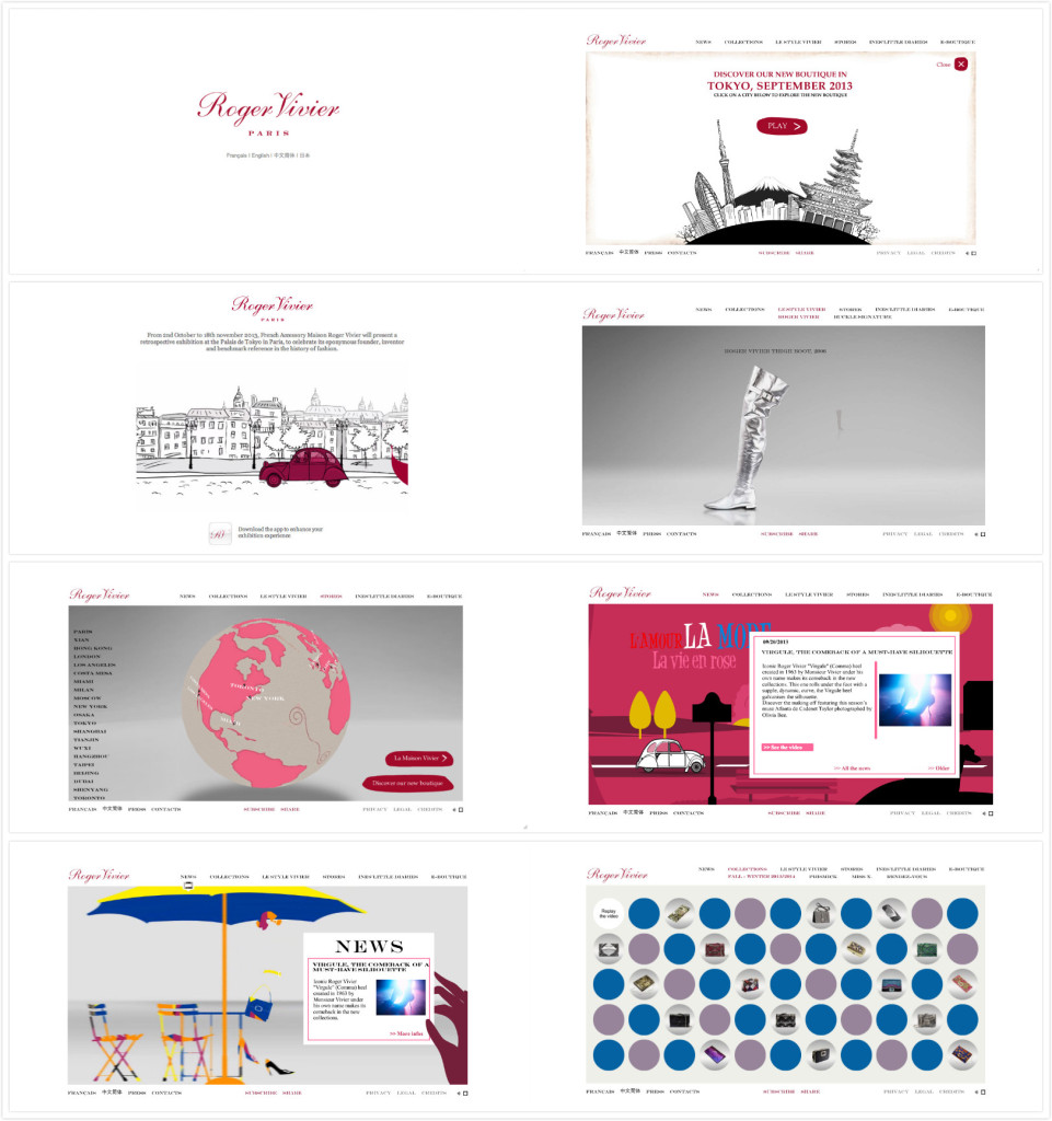
Roger Vivier’s website is one of my favorite website. As a fashion website, its very clean and elegant designed. The first page pop up is just its brand name in deep cherry pink in a white background. The wordmark is very elegant and classic which serves well as a fashion brand. The design makes people remember its brand at the first instant.
After choosing the language the customers would like to use, it pops up a funny cartoon video, which is also in red and black. People can choose to skip or watch the video. It attracts the eyeballs but not annoying (because you can just skip it) as well.
After that, you can see the homepage. The website has clear toolbars on the top including news, stores etc. You can find product information, location information, event information very easily just by clicking the titles. All the pages have either videos to help understand and explain the content or 3D cartoons to arouse customer’s interests. It also has some puzzle games to have fun on their website.
Some people complain they cannot shop on RV’s official website. However, personally I believe as a company’s official website, its main function to be promote the brand, introduce the products successfully and arouse customers’ interests. It serves very well. Once the customers have interests in it, they will always find their ways to buy products. This romantic, clean and elegant website is really good to visit.


I agree, the design used for this website is very clean and gives the impression of a higher-end brand. The fact that customers can’t buy products straight from their site would be an issue if the company’s mission was to increase their volume. Not offering the option to buy from their website simply tells customers that they are comfortable and stable with where they are at now financially. The designers also did a great job with having a continuous fun feel throughout the website with the cartoons and the games on every page.
I also agree. I think the website is used purely as a branding tool. Typically, more luxurious fashion brands will not include the option to shop online, because they don’t have giant warehouses and their items are more one-of-a-kind. This design is also successful because they maintained a constant color scheme that will appeal to women.