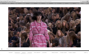
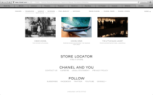
The website I chose was the homepage for the brand Chanel. When you first get to the site a video plays of women walking down the catwalk wearing the brand. When you drag your cursor to the bottom of the page, however, the page changes to a regular homepage with links to direct the user to other places. I think the design of the page is effective because the brand is simple and elegant, and so is the page. Additionally, the designer used the font that chanel always uses, so even though there is no large logo on the page, it is obvious what brand’s site they’re on.
GRA 217 Section 5 Group 1
The official blog for GRA 217 with Sherri Taylor


I really like how minimalistic and simplistic this website design is. Just like the Chanel brand, it is sleek, sophisticated and classic. The typeface of many components in the site is the same as that of the Chanel logo, which ties everything together nicely. The website relies heavily on black and gray, which also ties in the Chanel logo and keeps the website simple. I enjoy how the website relies heavily on high-quality images of the products instead of text. It helps guide the reader’s eye. Also, the menu bar is easy to navigate. When you scroll your mouse over it, a bigger menu bar drops down with even more subcategories. This helps organize the website and keep it looking clean.