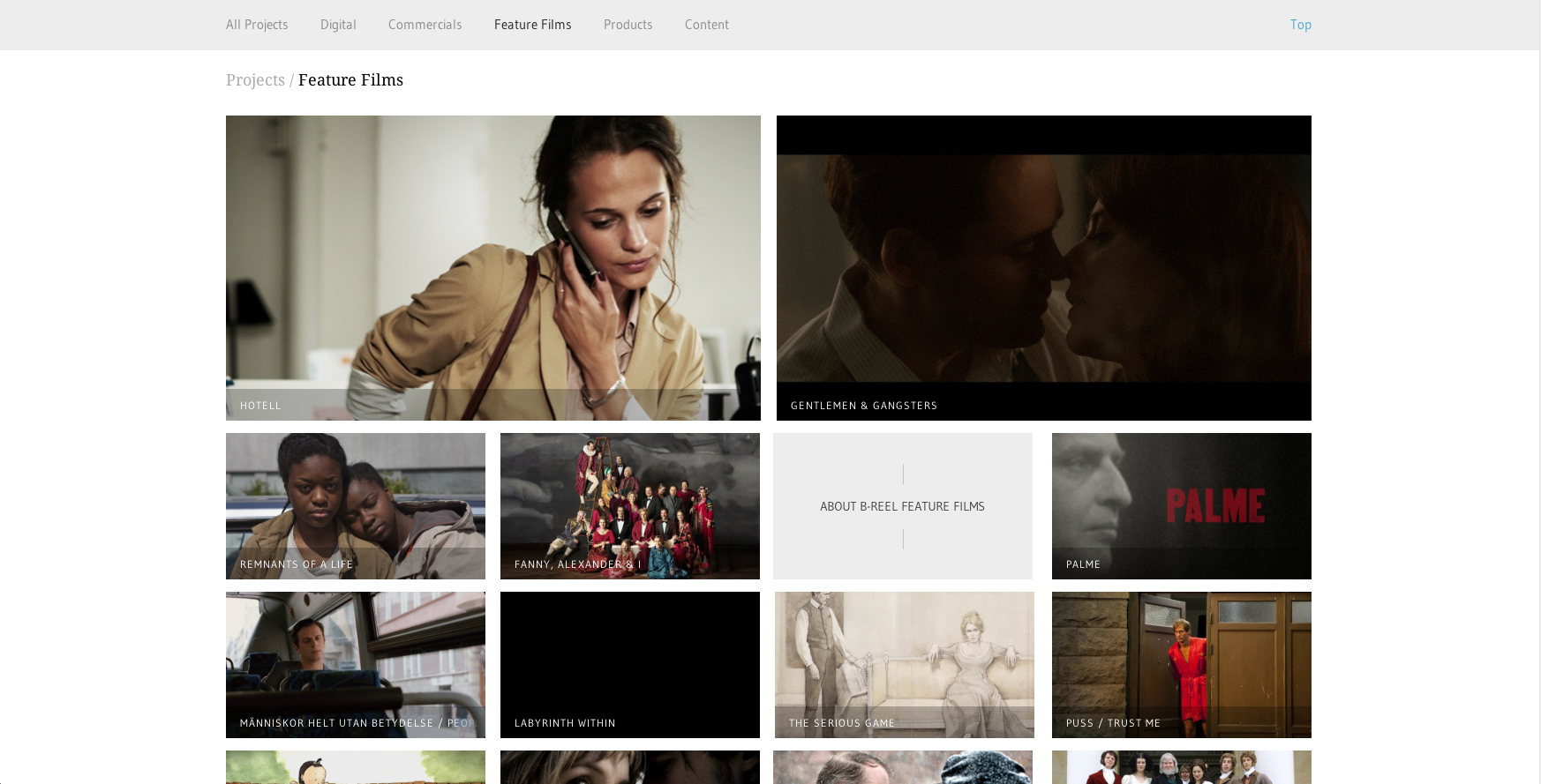
I chose B-Reel, a production company that has offices all over the world and who recently won an AWWWard in design. Since B-Reel produces films, commercials, etc., it makes sense that they would design their website to be extremely image-heavy. They separated their content into pages that are easy to navigate: Digital, Commercials, Feature Films, Products, and Branded Content. Their site is rich with large images, the largest at the top as features, creating visual hierarchy. It’s also a very clean design, making them look credible and professional.


I find this website extremely appealing. The menu bar of course is very organized and easy to navigate, but then when you get to each individual page it is very easy to navigate within it because, as you mentioned, they are very image heavy. Just by looking you can find what you’re looking for. The clean design is ideal for a company like this.