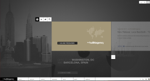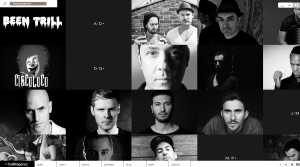
 This website design for The Bullitt Agency is really intriguing. First off the home page is visually appealing with plain but contrasting colors. The background is photographs of different cities, representing their global presence. On all the pages, when you hover your mouse over a box it changes appearance giving more information or presenting a different image. Also, the page with the artists and events shows a picture instead of just text, which gives a visual, something that viewers like to see to make a connection. The colors throughout the site are very simple, but it relates to the agency for DJs and Producers, a technologically based company, which the colors mirror. They also have a tab to their blog which is very helpful to viewers. Also, as you move your mouse over the page the page interactively moves with you, which is interesting because it shows that there’s more on the page than the eye can see.
GRA 217 Section 5 Group 1
The official blog for GRA 217 with Sherri Taylor


