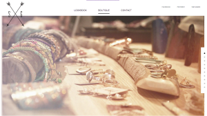
I really love the whole look of this website. Since the company Swell and Ginger is a boutique that sells women’s clothing and accessories, the website appeals to women. The light colors and simple typeface make the website appear very clean and pretty. The use of white space also adds to the page feeling very clean. I also really like that each page has lots of pictures and that they are all taken in the same light and edited the same way. The design of the website is very consistent and it is a great marketing tool for the company’s logo to appear on every page. I think the fact that the social media is all the way to the right and in a smaller font size separates the information very well.

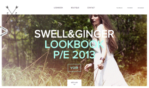
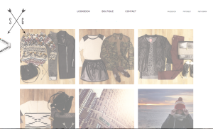
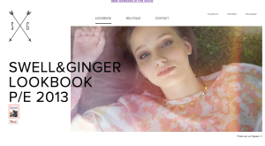
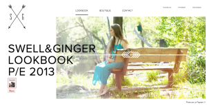
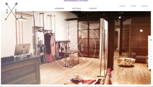


I really like the delicate color scheme of this website. It reminds me of an old classic movie. The design over all is simple and clean which gives the boutique a more professional appearance. I am also really drawn to the typography used, especially in the companies logo. It is symetric which automatically draws my eyes to it, and the lines are thin enough that they don’t take away from the image behind the logo in the picture of the room. Overall I feel like this particular website was designed well.
Right off the bat I am drawn to their logo with the intersecting arrows with the initials “S” and “G” on either side. Maintaining a simple, light feeling throughout the website design, I think the sans serif type with its bold emphasis is perfectly aligned with the company’s overall vibe. I love the detail, close up shots that are spread across the width of the page in contrast to the white space below. Overall the website has a strong design that promotes the company’s unique identity.
The feel that this website is giving off is very identifiable, it is very free spirited and nature inspired impression. For me, I feel more relaxed and like I can embrace my own look with these kinds of clothing websites. They use a lot of photographs of the outdoors and natural elements, reflecting their clothing which is light and non-conforming. In addition, the site is very simple relating back to the simplicity of nature ambiance.