
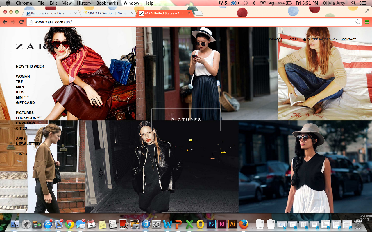
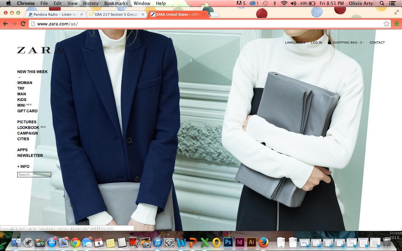
I have always been in awe of Zara’s website. It is so simple and modern. The minimalism in it makes it very easy to navigate through the website and it also intrigues me to keep looking the website. The website does an excellent job of showing Zara’s culture, and the style that the company is trying to portray. However, my one complaint is that the side bar get s a little lost.


I really enjoy the uniqueness of this website design. Between the menu bar being on the left side as opposed to the top middle, as well as boxing their background to show multiple pictures of their products, this website allows viewers easy access, while seeing all of the different products offered on each page.
I have always enjoyed this website, being a Zara shopper myself. When you first enter the website, I like the aesthetically appealing photographs, and the photos that are used on each of the main pages. Then the images of clothing are also interesting because it is not just one stance of the model; there is variation which makes the viewer want to continue looking at the selections. I agree with the image Zara portrays and how it is reflected in their site – the simplistic and contoured look they have in their clothing is shown by the minimalistic website layout.
What I really like about the pages you chose to post about is the way the website uses images. I really like that the majority of the page is filled with pictures which represents Zara’s product and style. I also really like that that the majority of the information is to the left and that they make the photographs the main attraction of the site. The type face is clean, yet a little edgy which I think represents their brand well.