
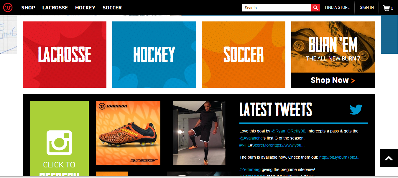
This website uses color scheme and font to appeal to its specific audience of customers. Lacrosse players commonly wear funky shorts with loud colors in absurd combinations. In the same way, this website uses sharp designs and vivid clashing colors to look cool to the lax bros. The menu at the top offers drop options in the same format. While the color on these is not as loud and prominent as the menu on this main page the font is strong and all caps. It is the same aggressive and fun format.


When I saw this I immediately made the connection that this website was designed for a more masculine audience. The bold colors and the contrasting white lines make for an eye catching desgin that stands out from other websites. I like the use of type becuase it resembles the boldness of the website. Using a typeface that is all caps gives the words a dominant prescence over the pictures. Over all the website looks clean and easy to navigate. The designer definitely encompassed the personality of the brand which gives the viewer the impression that the website is reliable.
The first thing I noticed from this page was the words “Burn ‘Em.” Just from this, you can tell the page is made to fast paced and active individuals. Furthermore, the bright colors and the all caps letters jump out at the viewer and initially grab their attention. In addition, The twitter section allows an interactive interface for viewers to connect directly with the website and the brand as a whole.
My favorite part about this page is how simple it is. It looks very easy to navigate. The bright colors not only help differentiate each section but also capture the your attention and make you want to stay on the page. I really feel like the designer did a great job of portraying the brands personality and understanding the wants of the intended audience.