
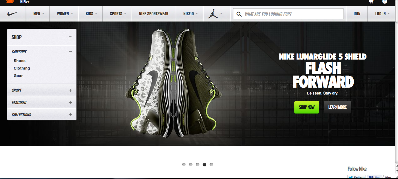
The Nike Website is very eye grabbing with its rotating screens to preview its products on the site. The Layout is very clean and the tabs are clearly written out without having to search for them. The absence of space and use of vibrant colors helps to make the products stand out even more to the point where you want to click on it to get more information about it. I think Nike did a very good job with the overall layout of this website and its attention to detail.


Admittedly, although the website does not take advantage of the use of white space, it still catches the readers attention. The use of different weights on the same font was very affective. Not to mention the overall navigation of the website is very clear and easy to understand.