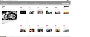
What I found interesting about Louis Vuitton’s webpage design was how convenient it was to the viewer’s eye. The designer uses white space to separate the different articles and objects on the page. In addition, they used a bold san-serif typeface to present an elegant impression of the website, alongside contrasting colors to catch the viewers attention and make it easier to read. I also liked how the rest of the page would fade out and the grey header would get more bold if you moused over a link at the top. Overall, the design works really well.


The use of white space on this web page is definitely crucial, allowing Louis Vuitton to separate their various seasonal collections, and really spread them out on the webpage without losing interest in the overall content. The colors used for each different collection also give the page a bit more flavor, and the ease of navigation throughout the simple layout allows the user to easily go about looking at Vouis Vuitton products.
I agree the website applies the smart use of white space. The page attached in the blog design like a calendar which looks clean and organized. On the other hand, each title has been put into different colors which make the picture look very vivd and colorful. The selection of picture is also very clean but modern, which fits a fashion brand company. After all, I really appreciate this LV website.