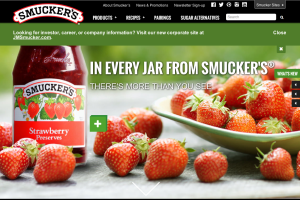
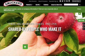
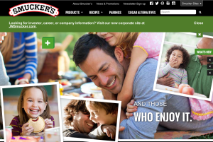
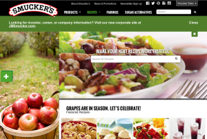
I personally love Smucker’s web design. They use a lot of colors and stick to a certain theme by incorporating a lot of pictures that have to do with each section of the website. I love how on the home page, as you scroll down the page it tells you Smucker’s mission and what they are truly about. It incorporates beautiful pictures of fruits and and foods that you can make with their products. This web design also gives off a happy feeling making you want to explore the website even more, essentially becoming more aware of the company and their products, which could lead to purchasing the product. This website gives me a lot of ideas that I could use in my web design.


I agree with you about Smucker’s web design. It is an awesome, colorful representation of their company. Smucker’s prides itself on using fresh and the best of the best ingredients when making its products. The colorful, happy images of fresh fruit and happy people makes you look past that it is just a jam or jelly and there’s so much more behind it.
Absolutely; Smucker’s uses the opposite of the white space strategy and instead fills the page with pictures and colors. I personally believe the use of such vivid imagery and prominent colors is to convey a sense of “fresh” in their product. The imagery and the message mesh very well together.
I think that the designer of this website did a great job at making each page consistent with Smucker’s image. Each page has the main emphasis on photographs. The typeface that is bold and in white on each page goes with the photograph, which ties the page together. I think it was also very clever to tell a piece of a story on each page using the white font, so it makes people want to visit each page to get the full story. I also really like that the designer stuck to three colors: red, white, and black.