http://www.kitkat.com/#/home
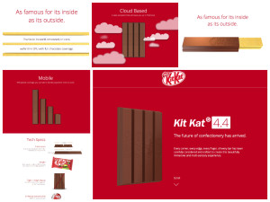
The website I chose to use was the website for the new KitKat 4.4. The website is designed almost more like an info-graph because instead of navigating you scroll down the page to get the information about the new product. It’s a very creative website because it compares the new candy to technology, for example its “mobility” is represented with the sticks acting as descending bars that resemble cell phone service.
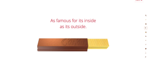
To apply the Gestalt Principle to this website we can look it its figure and ground. For example on the below “page” of the website the red words and piece of chocolate, as well as the navigation scroll bar all stand out against the white background.
As you can see in the below picture stitch of the website, the website is uniform with a common font and color scheme throughout. The proximity and alignment is on point.
The websites entire design is based on continuation considering it is one page and flows down to show all the specs of the new candy.
The visual hierarchy can be represented by the following page. The header of this “page” is written in a larger font and in red to signify that it’s important. There is then color variation when the information about the header is written in black.


It’s interesting how this website design is extremely reminiscent of the Windows 8x design. Flat boxes, clean lines and perspective changes to indicate which item is selected. I also think it’s very creative that the menu bullets are actually little chucks of KitKat.
Faites aux mthodes. To save a lot of time and hassle, and to ensure that you don’t have to break the bank to make your boyfriend appreciate your present, one of the best ways to get fantastic gift ideas for a boyfriend is to look at the ‘best selling’ gift lists and other lists such as the ‘most wished for’ and ‘most gifted’ lists. Rapha (cycling gear) uses a fair bit of blackandwhite, but like the Abercrombie and Fitch example, most of the product pages are in colour. In 2003, a small grouping concerned parents and others complained the fact that Christmas catalog released by abercrombie mnchen was simply too provocative for public consumption.
I think Kit Kat’s website does a very good job of using the gestalt principals. I like that the product is on every page and the main point of attraction. I also think it was very clever to use the kit kat to point and divide information. Another gestalt principal used effectively is the color scheme, which is consistent from page to page.