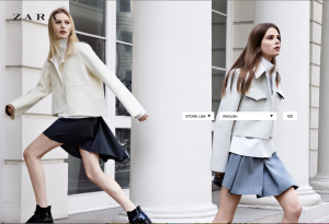
I know I have used this website as an example before but Zara’s website fit this assignment perfectly! They use this photo on the home page of the website. I think it really shows the personality of the brand. Zara is a very trendy, modern, clean-cut brand, and this background describes that perfectly with the movement in the photo and very neutral color scheme.
GRA 217 Section 5 Group 1
The official blog for GRA 217 with Sherri Taylor


I have also used this website before. I agree with this image. Also, the use of white in this photograph creates a simple photo that brings attention to the clothing. I think this image of the girls looking like they are searching for something is creative, as if they are looking for the store and even creating a sense of adventure, bringing the viewer into the website, giving them a sense to search, and further search the website.
This is one of the first photography examples that has been used on a website in which the the photograph is the entire background image to the home page. Overall I like how there is a lack of type. It makes the pictures stronger in a way and stand out more. The small amount of type that is used is very effective on getting the brand name across. However, I am confused on how to navigate through the website. Is the only way to move off of the home page to type an item into the search bar?