
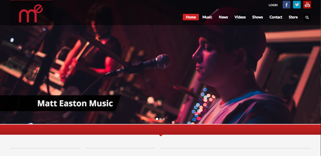
I love all types of music, and I’ve been playing guitar for the past seven years. As a result, I’ve seen tons of artists’ web pages, and all of them take slightly different approaches. Matt Easton is a relatively new rap/alternative artist, and his website is one of my favorites. Besides the great image, his graphic in the upper lefthand corner is great. It’s a stylized initial mark, which punnily spells “me.” Furthermore, the color scheme of the graphic, the website, and the photo all work very well together. The image is focused just on Easton’s form and the microphone, channeling attention on him. However, the viewer can make out the band and sound equipment in the fuzzy background. The effect gives the picture great depth, and also shows that even though Easton is the subject, he’s not the only thing going on. The navigation links are all very simplistic, allowing the viewer to focus on the graphic. I also love that the navigation bar on the top is not a solid color, allowing the graphic to show through.


Good find this is a cool shot. The deep and dark colors of the picture almost let you know what the music sounds like without even listening. Notice how the artist is not dead center but instead at the golden focus point dictated by the rule of thirds. That is the most effective part of this picture I would argue. The tilt of the photo is also effective. Although we view the picture in a horizontal focus the image itself is not on the same axis. This is kind of a neat effect.