
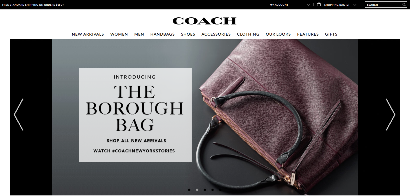
The Coach website relies on photographs to display the products and create visual appeal. The home page is basically a collage of many different photographs. The top photograph, which fits the width of the page, advertises a new or popular product. The colors are warm and neutral, which makes the photo stand out of the page and draws the eye. Since the photo consists of many colors and patterns, black text is placed in a semi-transparent cream-colored textbook to ensure the text can easily be seen and read. The photograph also balances the page because the text box and woman are placed in the correct locations in accordance with the rule of thirds.
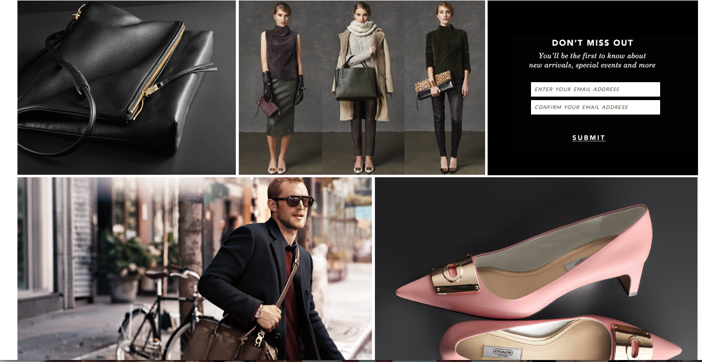
Under the large main photograph are other photos placed in a collage-like way with thin white borders between them. The color scheme of these photos is the same as the color scheme of the main photo, which creates connection and visual appeal. Lack of text ensures that the site looks pretty and simple instead of overwhelming.
The target audience of the website is women with enough money to buy expensive handbags, shoes, accessories, etc. The designer chose these images because they display the products and also show the class and sophistication of the brand with darker lighting, neutral colors and simplicity. The photos work together with all of the other elements on the page to create a sense of unity.


The aspect that I like the most about this website’s use of photography is the color pallet of the overall website. The darker and neutral colors work well together to create contrast and highlight th eproducts that the website is selling. The leather puruple bad, and the light pink shoes almost become the focal point of the two pictures. The photography is very high fashion and posed, but that seems to be the overall goal of the webiste. I also really like the choice of typography that is used. It is simple and elegent.
I agree with you that the color is warm and neutral and it really draws people’s attention. I think the black background color and the grey work really well. I like how the designer use the different background to differentiate each picture which just like what we learned from class.
Even though in the second the webpage, it displayed lots of products, as a view I don’t feel overwhelming. I guess it is because they use very simple background. The background of the “men picture” is different. I think it because the designer to show some difference between man and woman products. I like that pink color. Overall, the second webpage has lots of information, but it’s still attractive.