
Apple’s website is one of the best websites.
First of all, apple use the color dark grey and silver as its main color in the web design. The color looks similar to black and white, which is the best contract color. However, grey and silver comforts people’s eyes. And also, when introducing products, Apple always uses big and high-definition pictures that usually occupy the whole page. It makes the object stands out easily. Besides, apple products are usually in black, white or silver. These three color are easily stand out on a white web page.
Secondly, all the pages are applied the same font- myriad, the similar color – grey, white and silver and the same alignment. Apple website makes a good example of consistency and proximity.
Besides, apple also gives good example of visual hierarchy. The toolbar on the top is in grey. It’s not annoying or attract too much information while still gives its own function – navigate the users to different pages they want. They always put the big pictures of the latest product the company wants to advertise or promote on the particular pages. No other pictures will be bigger. It clearly attracts customer’s attention and would be distracted.


The Apple website incorporates the Gestalt principles very well.
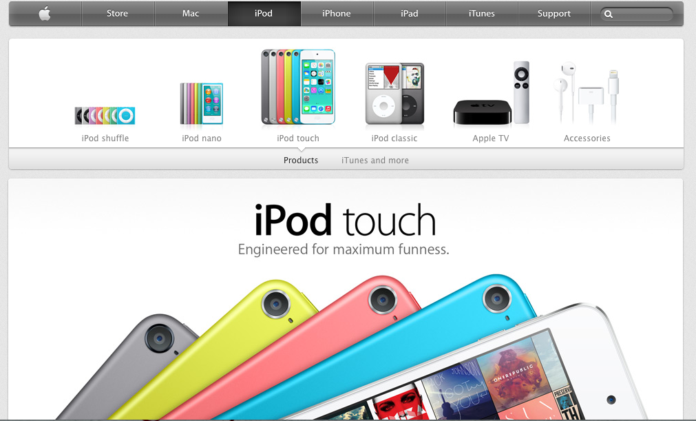
Figure and ground is established by dark type and colored images against a clean white background.
The same font in the same colors creates proximity throughout the website.
Since all of the elements (such as the list of products) are displayed on a horizontal line, the principle of continuation indicates connection.
Finally, important information (such as the words “iPod touch” on the page, are much larger and bolder to draw attention and create visual hierarchy. Important information is also accompanied by large pictures.
The designer of the Apple website is very good at incorporating the gestalt principles into their design. They use the same consistent typeface throughout the website, varying in bold type and regular. They also use gray and white as the background, allowing the white to pop against the gray. When a header is selected, it turns a dark gray which makes it stand out. With this background they incorporate pictures into the different links making them stand out as well.