
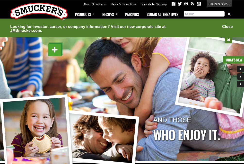
For this week’s post, I decided to use the Smucker’s webpage again because it has such wonderful photos. All of the photos on this page have a center of interest, they are clear with vivid colors, and they display what Smucker’s is all about. These photos show that Smucker’s is a family oriented company and that their products are meant to bring families together. The designer chose these photos because they most likely attract the attention of family oriented mothers and fathers with young children. The photos aren’t necessarily the lightest, however, the white font is readable against the photo and adds some contrast to the image and page.


I agree with everything that you have said in terms of Smucker’s going for a family-oriented feel. And they definitely achieve that through the pictures that they took. The other thing that I wanted to touch on was the arrangement that they used. By framing the pictures on the top layer with a square frame, it’s reminiscent of a polaroid. Also by putting the pictures together like a collage makes it seem almost like a scrapbook. Both of these ideas, polaroids and scrapbooks are positive hobbies and concepts that relate to being family-oriented and creating memories.
I agree, and I love this homepage. There’s such a sense of lightness and happiness, showing smiles and laughing, and this joy spreads to the viewer. I like what is said about the scrapbook look, a family item that brings people together and holds memories. Smuckers is creating the image that it can create memories with families and bring families together.