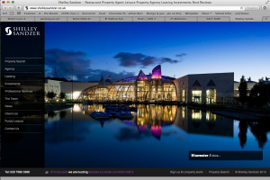
The website i chose to use as an example is Shelley Sandzer, a restaurant/leisure property agency based out of the UK. I think the image is effectively used because it captures the viewer’s eye and brings it right to the center of the page. Additionally, the image demonstrates the prestigious nature of the company and the scale and price of properties that they work on. The colors are vibrant and the image is sharp.


I think the picture works well. I was directly attracted by the picture. You mentioned that Shelley Sandzer, a leisure property agency. This picture is very peaceful and I would want to spend my vacation there. The whole picture is a little dark. I think it matches with the black background of the webpage. In addition, the quality of the picture is really high. The overall design could let me feel that this is a high-end restaurant.