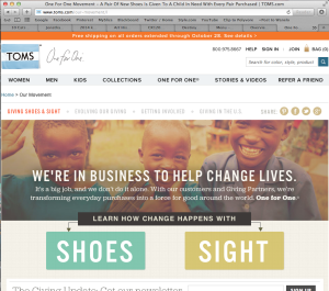
Toms is a company that sells shoes. However, they are unique in the fact that with every product that is purchased, TOMS helps one person in need – their one for one movement. The photography that’s used on their site for the One for One homepage is very effective. It is showing three young kids laughing and smiling that seem to not be in a wealthy society. But even still their happy, which portrays the image that the One for One mission brings kids in need happiness. This creates sympathy and shows people that they should buy Toms products to give back and help others. The colors are incorporated throughout the page, the orange in the header and text, the blue and green for the fill of text boxes. The colors of the photograph itself are cohesive and is an aesthetically pleasing image to look at. Warmer colors are easier to look at – the color palette of this photograph. This creates a cohesiveness throughout the page. It is also on the top portion of the page which immediately draws the eye in.
GRA 217 Section 5 Group 1
The official blog for GRA 217 with Sherri Taylor


I really like the image tom’s chose for their website, however I don’t think it is incorporated into the design as well it could be. The pros of the image are that it’s eye catching and extremely relevant to the cause. The colors in the boy’s shirts are then also used as the background colors for the “shoes” and “sight” text boxes.
What bothers me is the white space at the top of the page. I think it’s distracting and doesn’t work well with the image. If the space was blended to be the sandy, sepia-toned color of the image, it would look better.