
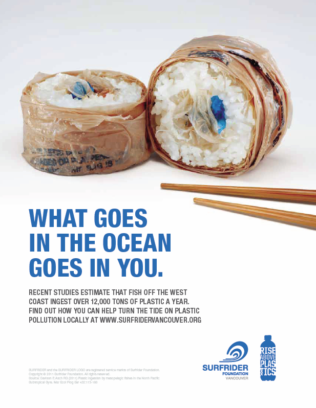
The major message this poster tries to convey is that polluting the ocean with garbage should be prevented because fish eat that garbage and we eat fish. I believe the designer decided to use this sans-serif typography because it is easy to read on a poster-sized paper, and the message is straight to the point. I also believe the designer used the color blue for the typeface to represent the blue of the ocean. The visual choices made were very clever. The picture is two pieces of sushi with a pair of chopsticks like it is ready to be eaten. The issue with these pieces of sushi is that the outside is wrapped in plastic, and the inside, where the raw fish is usually placed, contains more plastic remnants. The words connect very intimately with the graphic image because the words say that we eat fish and if fish ate plastic pollution we are essentially eating plastic. The picture shows exactly what the words are saying by showing plastic on and in the sushi pieces where food from the ocean usually is in sushi pieces. The poster met marketing goals by grabbing the attention of readers with an interesting visual, while having a bold, easy to read, and straight to the point message. It makes for a clever yet easy to comprehend poster. There is always room for possible improvements. I think that maybe the words could have been written on a path of a wave to drive home the ocean message even further. Additionally, one of the chopsticks could have pointed down toward the text to encourage the reader’s eye to read the message. Lastly, the logos in the bottom right could be smaller because the size they are now is a little distracting from the overall message.