
Monthly Archives: October 2013
Magazine
I think this design is perfect. The color of the title and the girl’s dress are consistent, which works very well. This color scheme–yellow, grey and black–is bright and comfortable. Also, the visuals on the left page are triangles shape, while the dress of the girl is designed as the similar shape as those visuals. On the right, the words and the visual combine together creatively. The girl’s eyes lead readers to the beginning of the paragraph. Overall, this design is smartly, using similarity skill.
Website Dominique Pineiro
Website Design Project
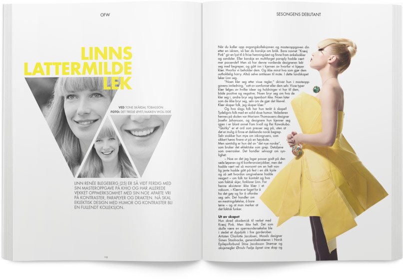
Magazine spread
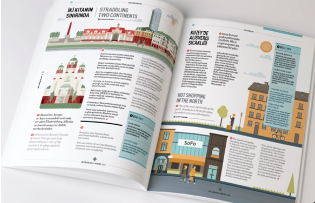
This magazine spread looks fantastic. It looks fun, casual yet very organized. Visuals definitely stand out and catch eyes. I like how the designer positions the visuals, which is really very well balanced. Also, colors in the visual work effectively as well. Red and green dominate the left side page while yellow and blue dominating the right half. Such color combination is smart — it sets the two pages apart automatically, which corresponds to the texts. The red dots throughout the page looks fun as well and introduces “similarity” that appeals to eyes.
Feature Magazine Spread
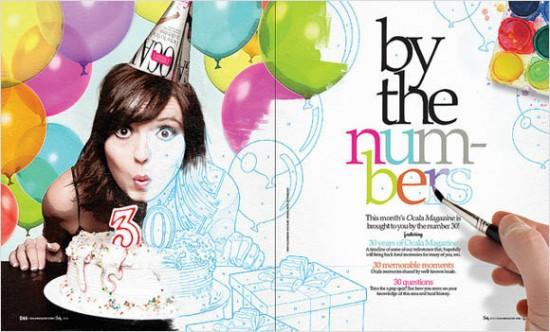
I love this feature spread about being 30. I think the way that the picture starts out in color but gradually turns into a sketch is very fun. I also like the way the hand is then painting in the colors on the headline. My eye is automatically drawn to the headline because the hand is pointing right to it. I also love how the picture overlaps from the left page to the right. It keeps my eyes interested and leads them straight to the text. Overall, this is a very fun magazine feature spread layout.
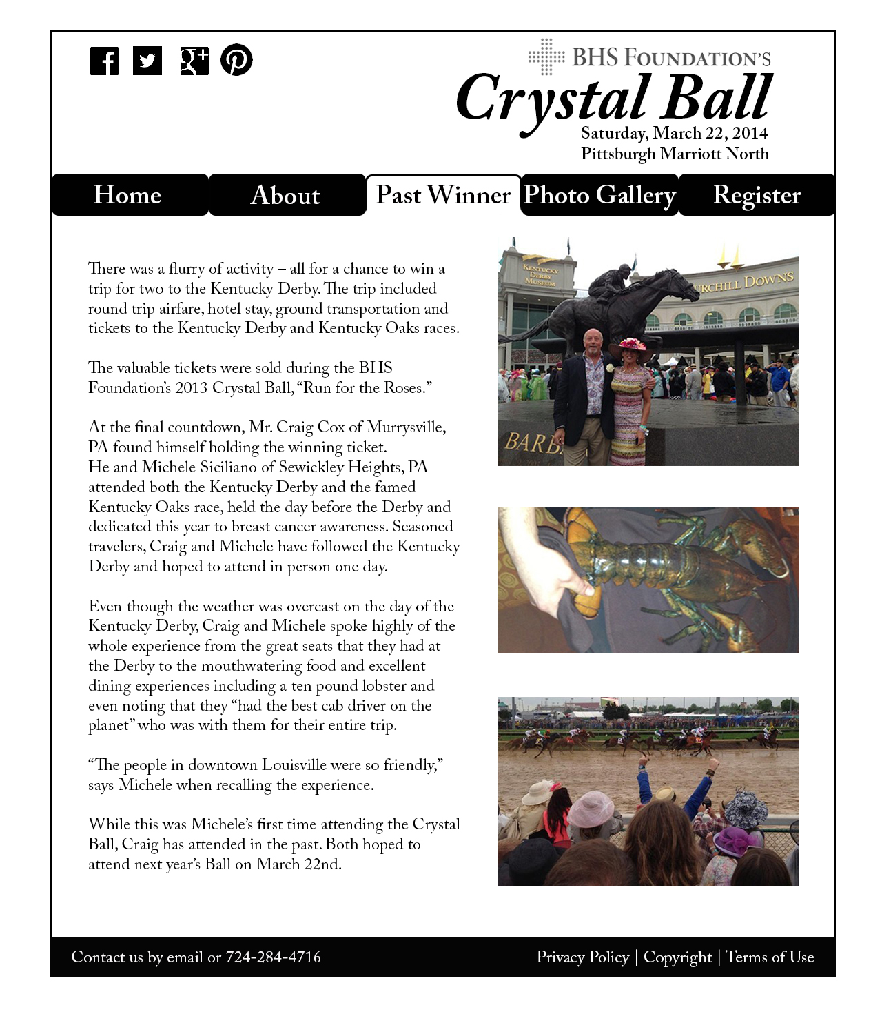
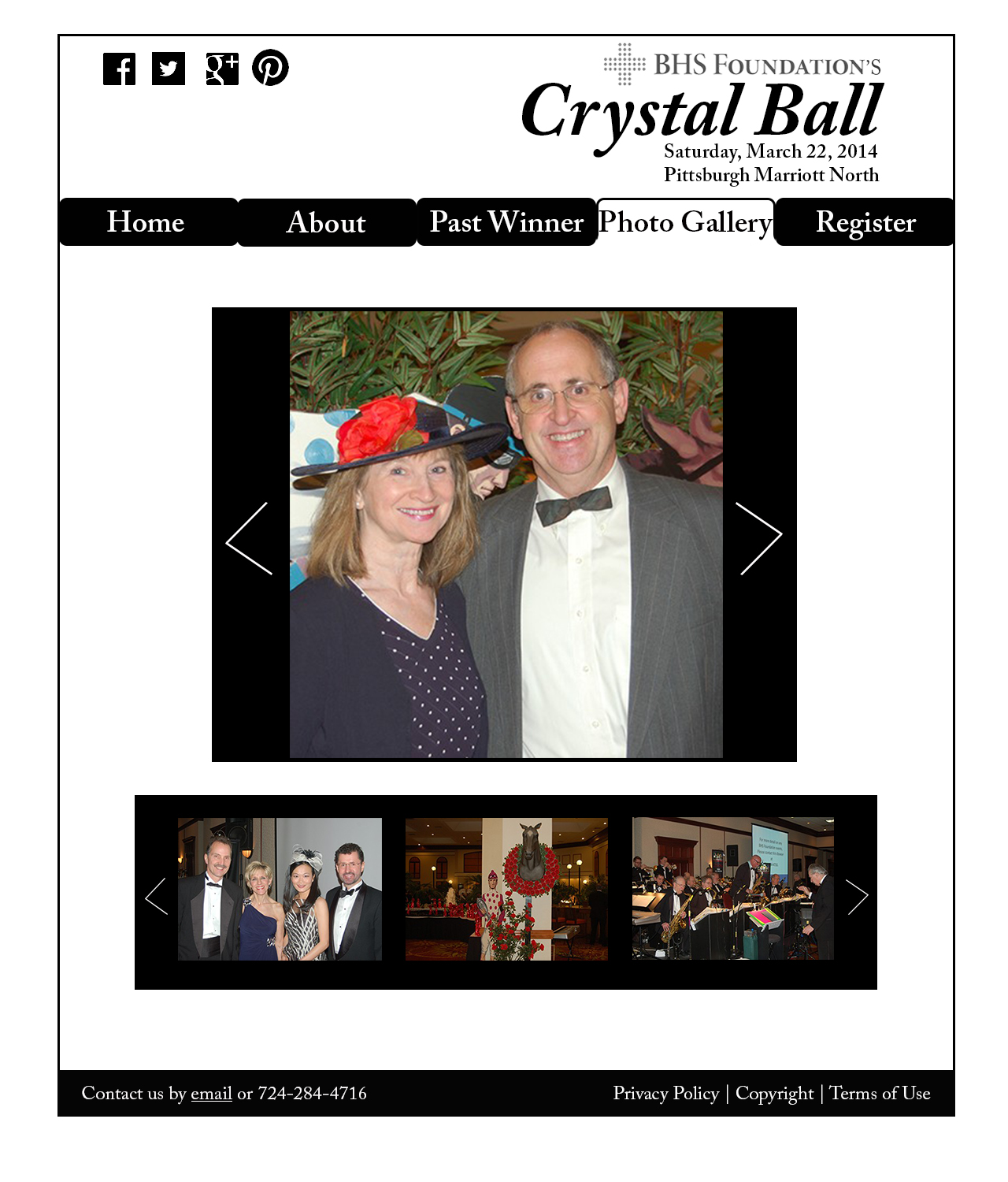
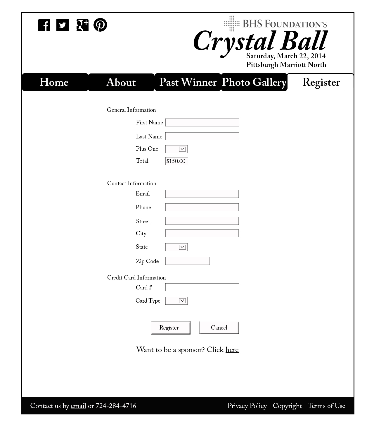
Crystal Ball Website Project
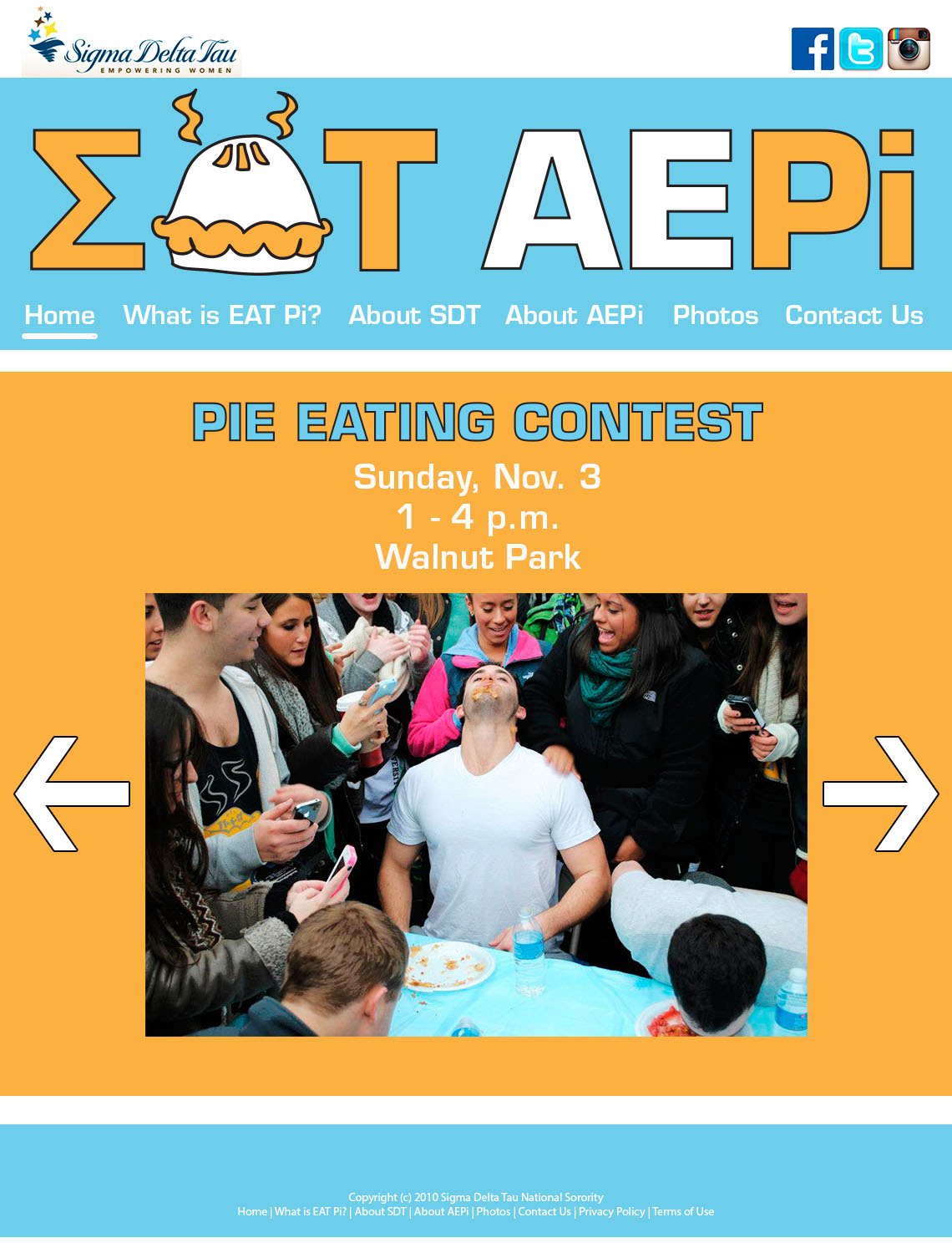
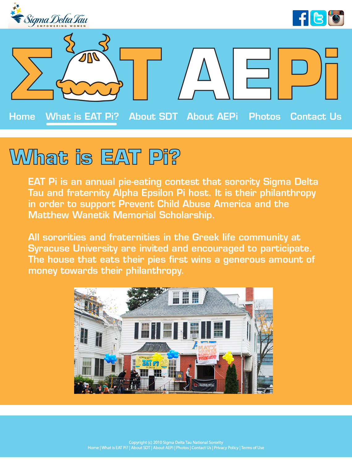
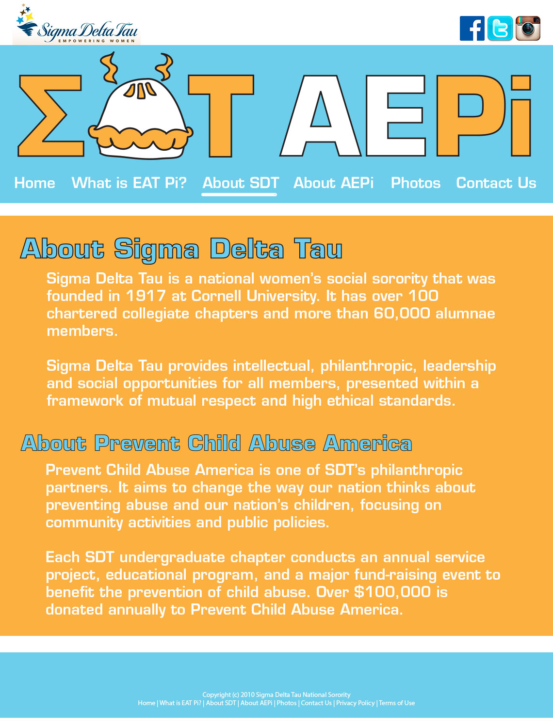
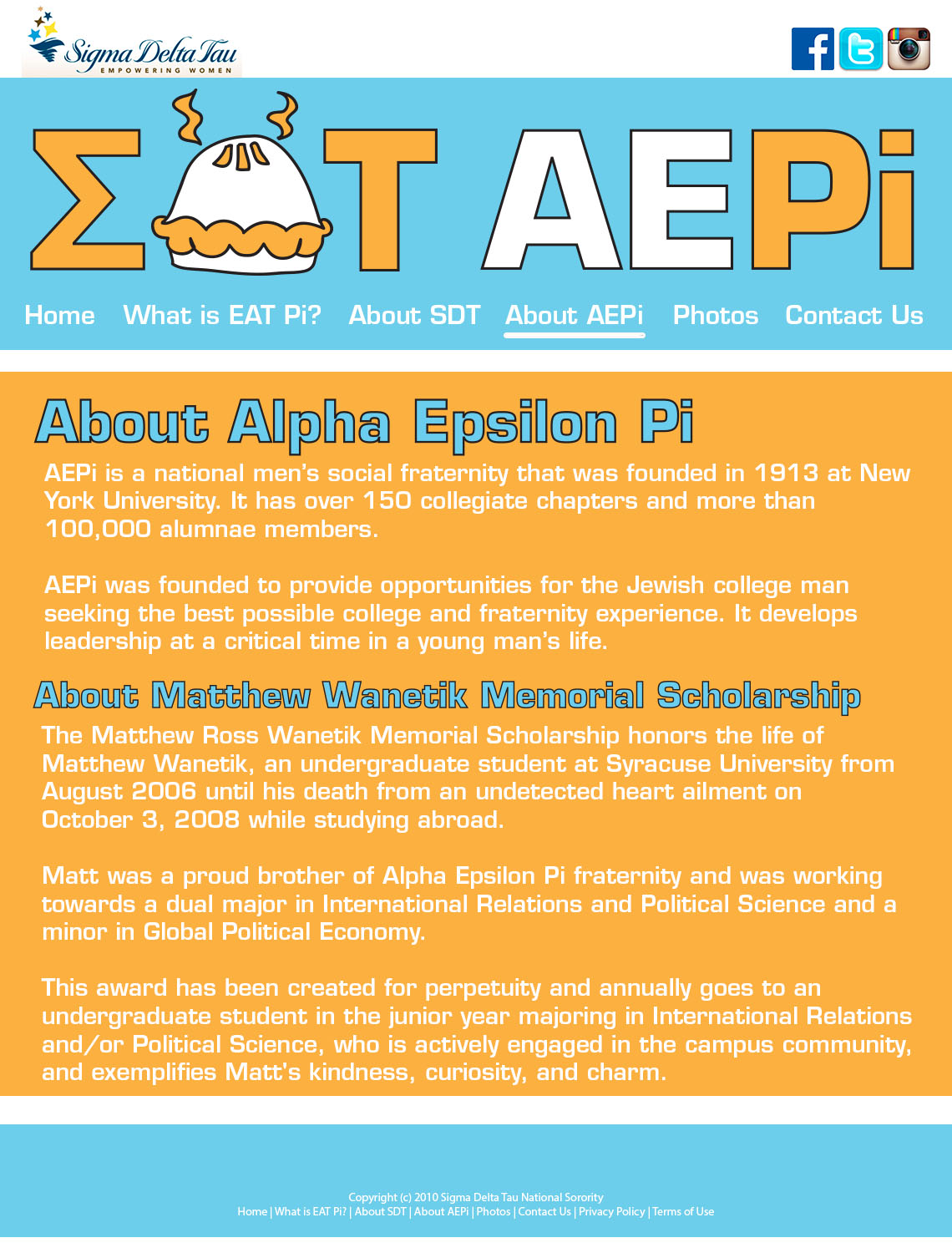
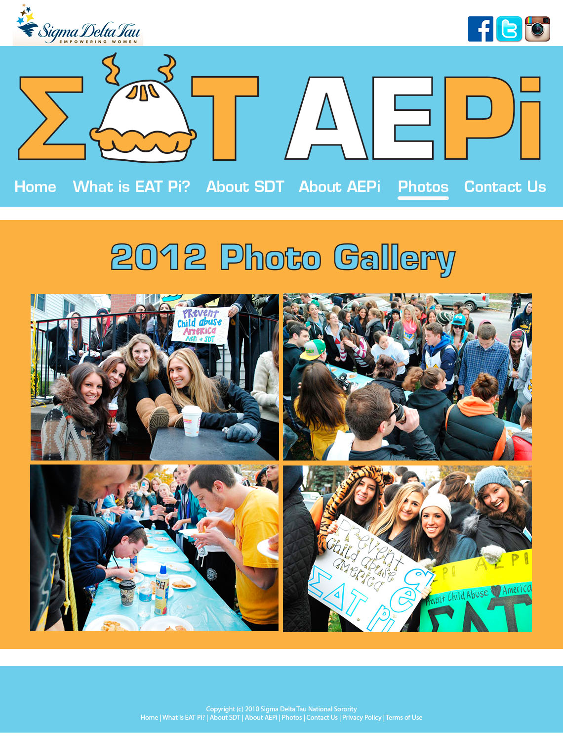
EAT Pi Website Design
Queen of Zef Magazine Spread
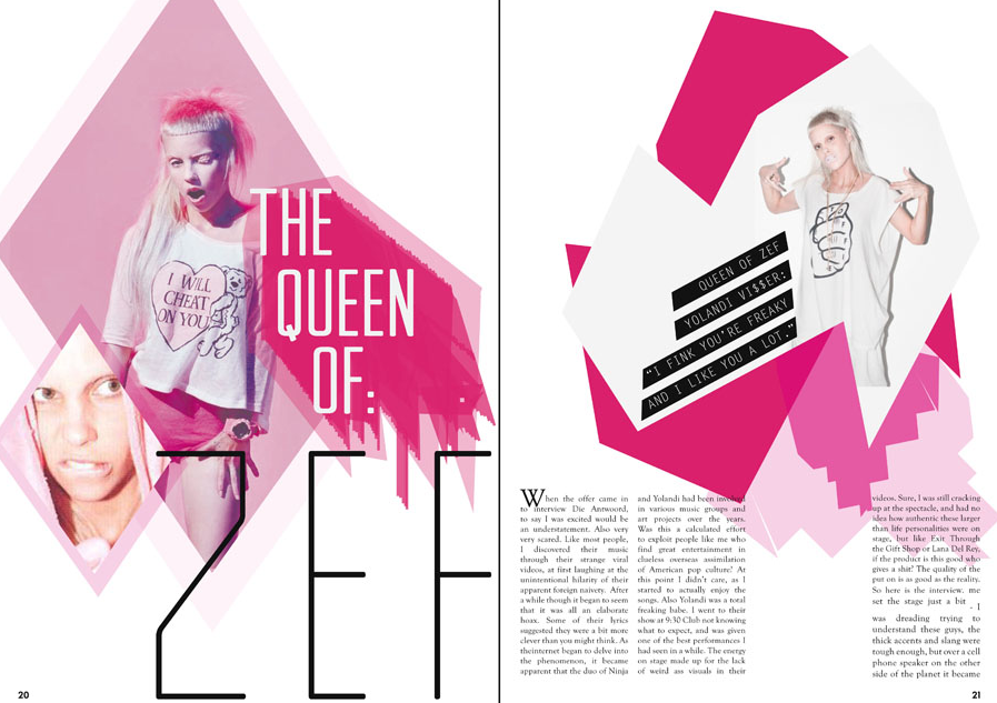 This magazine layout screamed out to me when I first saw it. It totally stands out and pulls the reader into it. It defines the essence of Gestalt theory that the whole is greater than the sum of its parts. This is because there are so many obscure pieces that make this piece what it is; it has the hot pink color, the wild facial expressions on the woman, and the retro typeface.
Magazine Spread
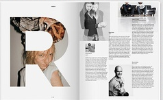
This magazine spread struck me because the “R” is so cool where the picture is coming through the letter. It makes the spread eye-catching. Also the black and white images on the right page organize the information and make it very readable, balancing the left image, in color behind the “R”. The top left image looks like it’s in motion and is also appealing. I just like the overall simplicity of this spread.