Interesting camera

retro


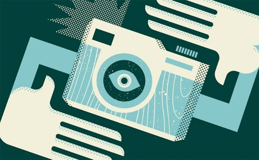
This picture, which was designed by Illustrator, is interesting. The major tool for this picture should be pen tool, and texture effect. The first step may be to create the two hands and the camera. The shape of the hands and the camera are easy to be created by using pen, rectangle and ellipse tools. And then, we can use different colors to make the figures more detailed and clearer. The next step may be to add some wood grain texture to the camera, and another dots texture to the hands and the part of the camera. The last step should be to rotate the whole image.

Austism Awareness

514_230x230_NoPeel

This poster seems to be entirely made by abdobe illustrator. I assume that the puzzle pieces are kerned by illustrator. Also, the fonts are so playful that it must’ve been uploaded from suitcase and then shaped by illustrator as well.

Week 5 AI techniques

hope-poster-78907e8fea9d1b5a9649277c760828ae15c7b024-s6-c30

This is a poster of Obama’s 2008 presidential campaign. The poster is designed by Shepard Fairey. The artist used several layers to introduce a 3D effect. Tools the artist could’ve used include paint bucket, filters (to transform the texture from photo-alike to sketch-alike). The major steps for producing this poster would include setting multiple layers with each in different color, filtering, and using paint bucketing.

illustrator.

alaska2

This is a Alaska travel poster made with Adobe Illustrator. It is a very linear design, so I assume the designer used the line segment tool to create the mountains, trees, tent etc. They probably used the arc tool to create the lake, the island, and any other rounded objects. I am sure the designer created only one mountain and one tree and duplicated them and changed the colors. They added dimension to the mountains by adding highlights and shadowing just by making one side of the mountain a darker shade of blue. They also made the mountains and trees in the background smaller and with less detail to create depth. They cleverly positioned the mountain peaks to be the “A”s in Alaska. The other letters were created with the type tool and given dimension with the dark shading behind them.

Marley’s World

Bob Marley

This illustration of Bob Marley is made with a black background then layers and layers of colored geometrical shapes placed on top of each other. The layers are necessary to get the overlap of shapes and to create the angles that emphasize the details of Marley’s face. The only circular area of this illustration are Marley’s eyes, but aside from this, this entire picture could have been created using both the pen and shape tools. By using white in the middle of Marley’s face, the artist has created the illusion of light shining from the aside which makes the entire piece look more three dimensional despite the hard angles and modern design. What I like most about this piece is the way the artist used all different shades of green, yellow, red and orange which is very indicative of Bob Marley and the way he has always been publicly portrayed. Even with the harsh sides and angles of the shapes emotion and personality still shines through Marley’s eyes and face in general which I think is well done considering the design of the illustration.

FURI KURI

9368070035_61c8b83fe2_o

So whats is FLCL? Fooly Cooly, furi kuri, a weird dance made up in the Gundam series… Well no one knows, and I guess its better that we don’t get into that tonight. So here we have a vector work of the show’s main character, Ta. As you can guess the artist was some pompous jerk that was trying to be abstract with the design. Really dude, its only half of a face and I am supposed to feel some sort of emotion from this…..

Well, Like every post. I digress. The artist used Adobe Illustrator so that he could use the artwork in any size. Using the pen-tool he made each section separately in various layers. IE hat, mouth, eyes. He used the sloppy style to give a sorta pastel effect. Very nicely executed, but I would still call the artist a jerk….If I ever met him,.


Week Four Post – Illustration

This illustration of John Lennon was made using a combination of the pen, brush and gradient tools. When making illustrations like this you have to use multiple layers and change the stroke on the lines to get the nice shapes and harder edges that make this illustration work. What I really like about this one is the expressionistic use of color the artists take on how the light hits the subject. This piece was probably a trace from a portrait of Lennon, but I could be wrong. Either way avery nice piece in my opinion. johnlennon

Atlanta Falcon

299

This fine piece of artwork was made with the pen tool. I’m also pretty sure the artist used multiple layers while making this. One separate layer for each color, and one for the shape of the white beak and eyes. It’s made with straight lines and bezier curves. It’s a straight forward layout, but it embodies the strength and power of the mighty Atlanta Falcon.  If I were to recreate this, I wouldn’t. It’s already perfect.

Adobe Illustrator Rock Out

adobe_illustrator_tutorials_27

In order to create this artwork on Adobe Illustrator, the designer selected a horizontal document. Then, the designer took a photograph of the man singing, and inserted that photo onto the document. In order to create the shapes, the designer probably used one of two possible techniques. One, he or she used the symbols tool and dragged the loop symbols onto the document. The other option is that he or she used the arc tool to make the arcs of the loops. Next, the designer used the shape tool to make the circles. After the designer had all the symbols and shapes in the desired placement, he or she filled them in with different colors using the swatches library. Lastly, in order to create the shading in the some of the circles, the designer most likely went to ‘Recolor Artwork’ and added black or white tint.