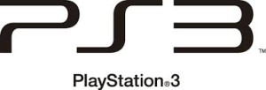
Okay, so let’s talk about wordmarks. I am taking the approach of looking at the new and the classic. There are two minds to design in my opinion. There is the classic that gives the audience a sense of nostalgia. You know, like when we talk about America and we think of a woman with rolled hair putting an apple-pie on the windowsill. Then there are the new designs that give you the feeling of…Well I guess branding would be the best way to describe it. We look at “5” gum and we think of cool, sleek and even cold metal for the most part. That brings me to my first choice, the PS3 logo.
The reason I like this wordmark is because it’s both new and nostalgic in the same design. No I am not saying nostalgic like PS1, I mean true nostalgia. Think back in the days of IBM. We look at that old logo with the lines, and the line-printers, (and if you’re old enough) you think of the perforations in the paper. I don’t know about you, but I drove my mom crazy when I would throw those around the house.
Though back then, we looked at technology as a big box. It took up space, it was considered something powerful and should be revered. Smack one of your knucklehead kids if they even looked at it the wrong way.
Oh, so that just my childhood….awkward.
Though I digress. Computers and technology became so much more over the years. We stopped revering the technology, in the sense of, we didn’t buy giant furniture to house our huge floor-model televisions. Technology started adapting to us. That’s the sense that I get from the PS3 logo. The way the lines contour, they are saying that technology is sleek and flexible.
Like what audience?
Like humans.
Now I say this as I hate video games and don’t even own a PS3, but its a cool logo. Now let’s talk about real classics.
Oh Newsweek, let your print format rest in peace. I spoke about the nostalgia of certain things, and what it makes you feel just by looking at it. When I see Newsweek, I think, “Now this is NEWS. They mean business.” There is the old english script, which looks as if a scribe got high off the fumes and just went with it. But this Newsweek logo says something different. News has become efficient. Quick, clarity, and straight to the point. You get that by the block text, that the organization doesn’t have time for games. You get what you read. The news of the week. Though to me honestly; it says professionalism. Something that at times can be lost by our very creative (but sometimes overzealous) designers.
Less is more… Well thanks for reading.
TWL


