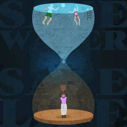
 This illustration effectively identifies the disparity in water distribution throughout the world in one clever image. Yet how is it so effective?
In Adobe Illustrator and illustrating in general, perspective is key. Through applying multiple shades of color throughout the image and placing the words behind the illustration, there exists a sort of depth that wouldn’t exist otherwise. It is also important to note the figures within the hour glass and even the hour glass are simplified. There is very little detail in the shapes, but the shapes are recognizable. Most if not all of the shapes involved in the illustration can be created through utilizing the pen tool. There are other tools such as the gradient tool that can also provide shadow or a sense of light progression which can be seen in the faint aura behind the drop of water.
The most effective illustrations are not complicated yet discuss an intricate, complex idea. A simple hourglass is transformed into a potent metaphor of the water crisis that the world is facing.
