Adobe Illustrator


gra 217 blog


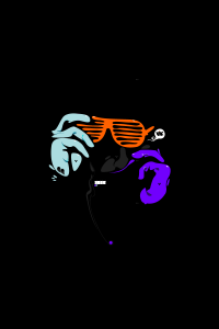
This is a piece of art that was created in Adobe Illustrator.  From my perspective, I believe that this image was created with the pen tool.  It particularly catches my attention because the lines are not straight, but curved to give off the idea that this image was hand drawn.  Furthermore, the use of the black background makes the other three colors of the image pop to the viewer.  Overall, this image is extremely well done.

Week 5 Illustrator

This image looks like it used both the pen and circle tools to create this flower, with a lot of gradient coloring used to fill it in. the color swatch palette might have been used in the center of the flower. The leaves and flower petals look to have a yellow stroke around them to to separate the flower from the white space. The image can be completed in illustrator, But coloring looks lIke it can be done in Photoshop as well.
Typography

typographic-map-us


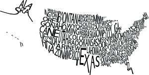
I really liked this typographic image of the United States. I thought the font the designer used works with the image because even though the words are crowded, it’s easy to see which state is which. I think the use of only black and white was also smart because had the designer used color, the entire image would have been harder to read.

Typography Design

30-Beautiful-Examples-Of-Typography-Design-30

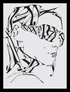
I find this typographic image particularly interesting because it creates an image using primarily three letters: X,Y, and K and one typeface to compose the image. I think the Serif typeface the designer chose really adds a elegant and fashion feel to the design. In order to create this image, the designer used an array of sizes for the letters, stretched the letters, and flipped them. I find the small x on the women’s check particularly interesting. At first I thought it was a mistake, but then I realized the designer used it as a beauty mark. Another interesting aspect of the design is that the girl has no distinct ears, yet because of the placing of the letters it does not detract from the design. The one thing I did not understand was why the designer chose to have a Y coming off the women’s chin because the chin is already defined without it.

Typography

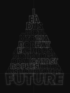
typography-designs-11I was drawn to this typography design because at first glance you see letters constructed into the shape of a pyramid. Looking closer, the letters form words into the phrase, “Lead us not into war or hate, lead us not into global catastrophes, lead us not into into the future.” The words get bigger as the sentence continues, ending with the word future as the largest in the pyramid. This ties in with the overall look of the type, the letters being formed by constructive lines, as if they could actually form a 3D object. Also, having the black background and clean cut white lines seems futuristic.

Typography Post: Week 4

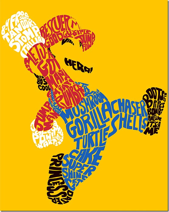
.I like the design of this using typography because it never says in any of the words what the design actually is. Everyone knows that it’s the super hero character Mario. It does have a lot of words and catchphrases that are related to the Mario franchist, such as “it’s a me!” and “Mama Mia!” and “princess” (which refers to Princess Peach. I know that distortion is a giant no-no in most typography, but it definitely works in the designers favor in this instance. I also think that without coloring in Mario’s shirt and overalls, and the design was all black, it might have been harder to pick up on the fact that this design was indeed Mario the plumber. So, the elements of the design that I like are the distortion and the coloring.

Typography Post

ikea


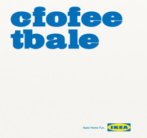
A few years ago, a study came out about being able to read and comprehend jumbled text. Here’s an example from FOX News, too — http://www.foxnews.com/story/2009/03/31/if-can-raed-tihs-msut-be-raelly-smrat/. I thought it was very clever of IKEA to make use of this trend in one of their ads. Along with clearly rearranging the letters, the typeface that they used is very effective. It being large and essentially the only thing on the image is eye-catching and makes people stop and wonder what the ad is about. Also, the slogan that is printed on the bottom, “Make Home Fun” goes along perfectly with the message that their use of typography is conveying.