
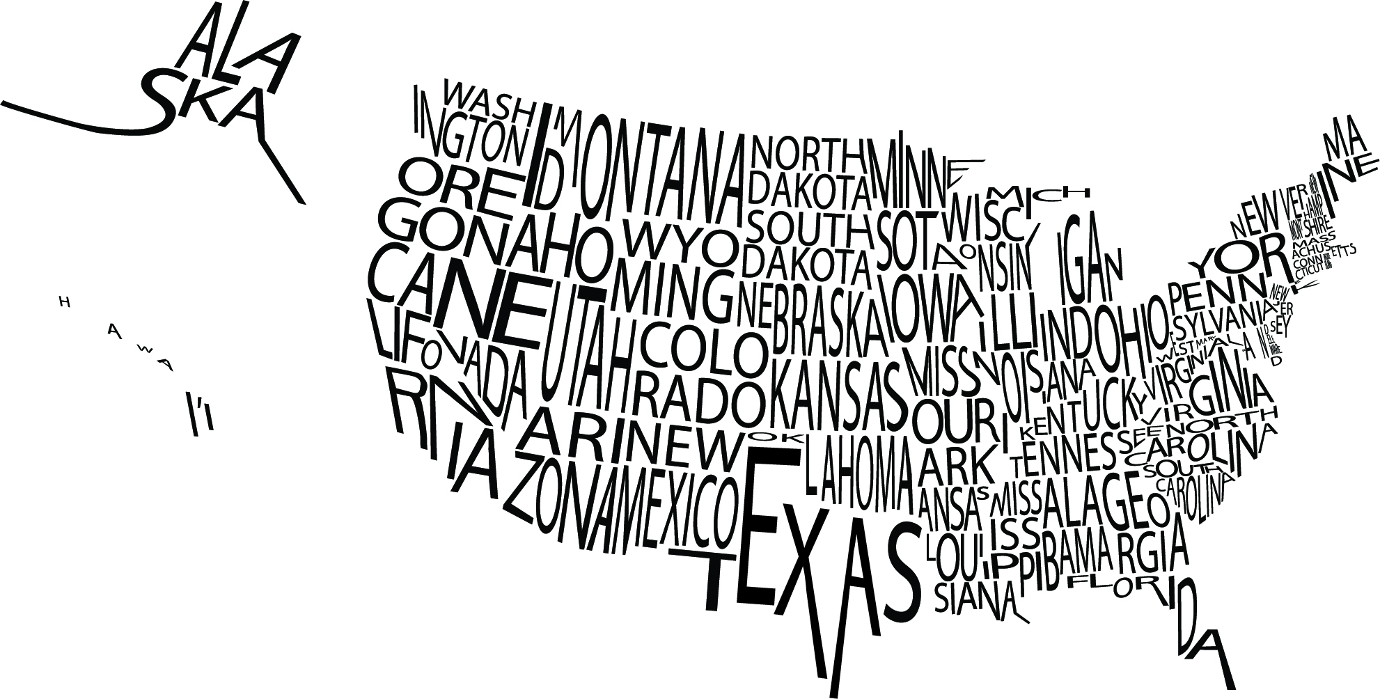
I really liked this typographic image of the United States. I thought the font the designer used works with the image because even though the words are crowded, it’s easy to see which state is which. I think the use of only black and white was also smart because had the designer used color, the entire image would have been harder to read.


