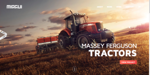
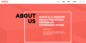
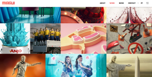
The website I chose was for Miagui Imagevertising, which creates images for advertising. The first thing that drew me to the homepage was its ease and simplicity. The picture of the tractor takes up the entire screen, and the unique perspective and warm, vibrant colors draw you in. Since Miagui specializes in creating images, it is very fitting that the home page of its website relies entirely on images. The white sans-serif text looks clean, fresh and natural across the photo. The only problem I see with it is that some words in the navigation bar (like “contact”) are hard to read against the background. The title of the website, Miagui, stands out in the upper left-hand corner. However, the eye is initially drawn to the featured item, Massey Ferguson Tractors, and the viewer of the site can easily click on the red button to learn more about the project. This feature, combined with the navigation bar, demonstrates the ease of navigation. The menu bar is clean and simple. When you visit a different page, the title in the menu bar switches from white to red. When you scroll down on the homepage, more information about the company appears. This information also relies heavily on images, and includes links to different sections of the website. I also like how the red Miagui color is consistent throughout the website, as shown in the “About” page below. My favorite page on the website is the “work” page (shown below), which is basically a showcase of images created by Miagui. People can scroll down the page to load more images. The design of this page is creative, functional and appealing.


I like this website because it is still functional and easily navigable but doesn’t immediately look like a website. This website lacks the typical design that most do (navigation bar across the top of the page, text below) And the general lack of text overall makes the website appear very clean and modern. I also like the tile style of the layout, it is very indicative of the Windows tile style layout and many other tablet designs. The use of color also gives the website a bright, welcoming vibe.
The website boasts strong photos that dominate the page, but in an effective and not overwhelming manner. Sleek and modern, the design balances white with brighter colors to draw attention to certain aspects of the page. With bold, capital typography, the website portrays strength and confidence in its message and design.