
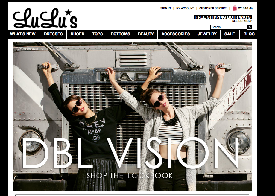
- figure and ground: The company’s products stand out very clearly from the background. By making the background black and white the color of the products really pop out at the viewer.
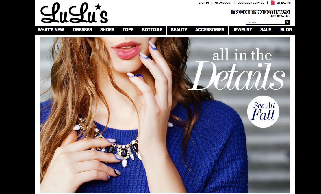
- proximity and alignment: Black and white are the only two colors used for the website’s typefaces. The majority of the site is in San Serif however the name of the site and some of the titles use different typefaces to draw attention to certain words.
- continuation: All of the different product categories are listed on one line below the title. Any other pertinent information is in a line on the top right and all the social media is in a line on the bottom left corner.
- visual hierarchy: Lulu’s website does a good job at this. Any words that are in white and on a black background are links and will connect you to a different page. The home page goes through a slide show of different images, the type paired with a image is significantly bigger than the type on the rest of the site. This draws your attention to the middle of the page and to the collections they are trying to sell.


This website incorporates figure and ground effectively by placing white text on a black background or over a colored image. This strategy is space-saving since the images double as backgrounds for text, but the color differences ensure that the text won’t blend into the pictures.
Proximity and alignment are incorporated by the use of the same sans-serif typeface throughout the website. The typeface of the Lulu’s wordmark is used on key words of the website as well, which also creates visual hierarchy since it draws the eye to important information. Visual hierarchy is also seen with the headlines and titles, because they are large on the page compared with other text.
The website makes good use of visual images. The pictures are clearly big and eye-catching. People are easily attracted by these big, beautiful images. The use of same-sans-serif typeface always give good functionality. The typeface is very clean and gives good readability. Besides, the leave of white and black space make people focus on the main content of the website.