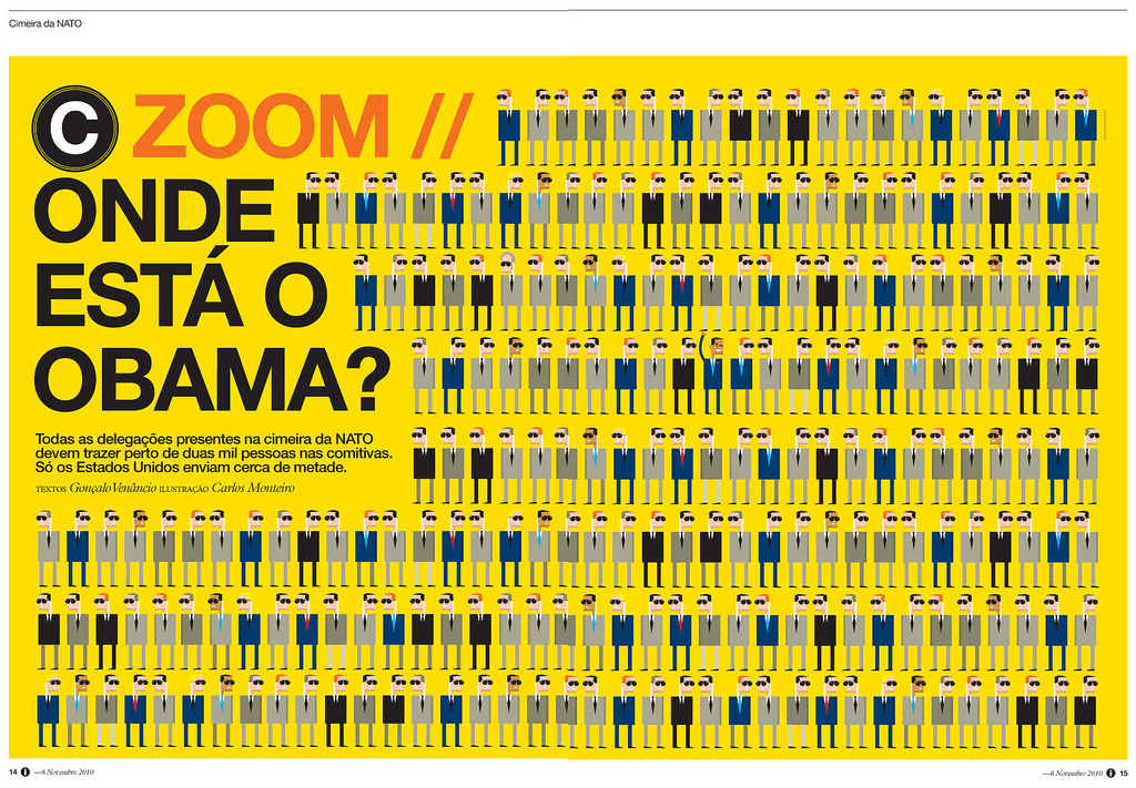
 This Portuguese news magazine, i jornal, is consistently one of the most well designed news magazines in the world. Even their website can be placed among the top tiers in web design. However, at a more fundamental level, this individual spread stands out because of the simplicity, repetition, and the visual connecting with the words. Even if you can’t read Portuguese (I sure can’t) the article is about Obama and his place among other political leaders. This can be seen in the quirky-yet-simple portrayals of the individuals and the contrast of Obama’s arm raised. The yellow background also draws the eye in to see what the fuss is about.
Monthly Archives: November 2013
ESPN Body Issue
I have always loved ESPN’s Body Issue – the photos are stunning and represent what it truly means to be an athlete in such a diverse world. Since the photos take up the entire space of the spread, the dominance is placed on the athletes. The type is simple and informative, adding to the accomplishments of the people featured. Leaving the text small and in one specific corner keeps the focus on the human body and the amazing things humans can push them to do. Oh, and Kaepernick is (a) damn fine (quarterback).


