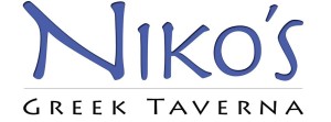
This typeface, most closely related to Aeris Pro A Bold, is very well-suited for Niko’s Greek Taverna. Being a Greek restaurant, this typeface adds a very “Greeky” feel to the wordmark, and therefore, gives the restaurant more culture that is crucial for its success in the restaurant business. Due to size and color, “Niko’s” is the main focus of the wordmark, which brings out the significance of that particular name to the restaurant. The type surely aligns with the brand identity design because the wordmark accurately portrays the feel of the restaurant.
Category Archives: Posts
Disney Wordmark
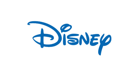
The fun typeface, Lettering Delights Walt, of this workmark coincides with the magical persona that Disney is renowned for. The color blue, being an inspiring color, also adds life to this wordmark. The designers made this wordmark stand out by making the shape of the typeface so distinct and unique to Disney, thus creating a memorable visual experience for the viewers.


