
Author Archives: Courtney Inbody
High Performance. Delivered.
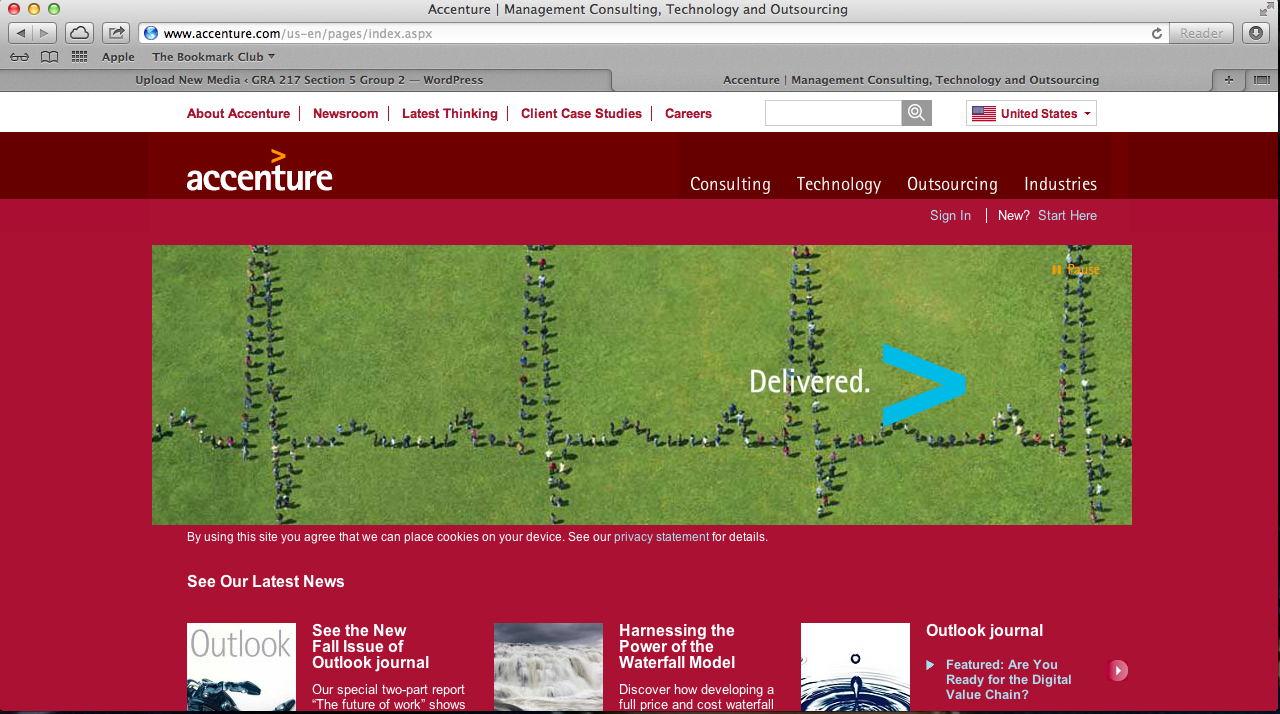
I am very biased in this post, as my parents work here, but whatever. I like Accenture’s website design primarily because of the scrolling visuals that are always present on their homepage – with the clients that they represent and their logo, the accent mark (ahem, hence ACCENTure), moving forward, etc. The links to different aspects of the website are clearly defined, and contrast with the colors of the backgrounds they are on. Red is a warm color, thus standing out to whoever is viewing the page. Also, at the bottom of the screen, there are short snippets of information as the “latest news” section of the homepage. Not included is the very bottom of the website, which includes social media such as Facebook, LinkedIn, Twitter, YouTube, Google+, an RSS feed, podcasts, blogs, and much more. It’s a very clean design, emphasizing the modern and advanced nature of the services one could get by working with Accenture.
Simplicity is like a Box of Chocolates
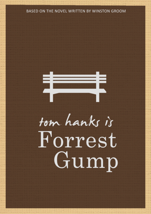
Another personal favorite (sorry guys for all of the movies). This is probably one of the simplest designs on Illustrator anyone will find. The park bench, where Forrest tells his story, is central to the movie itself, without being one of the scenes to capture his life story. The pen tool is obviously used to create the straight lines of the park bench, and none of the curves of the pen tool were used because it simply was not necessary. This poster is simple and straightforward and captures Forrest’s simple attitude towards life effortlessly. Go pen tool.
Vivaciously V
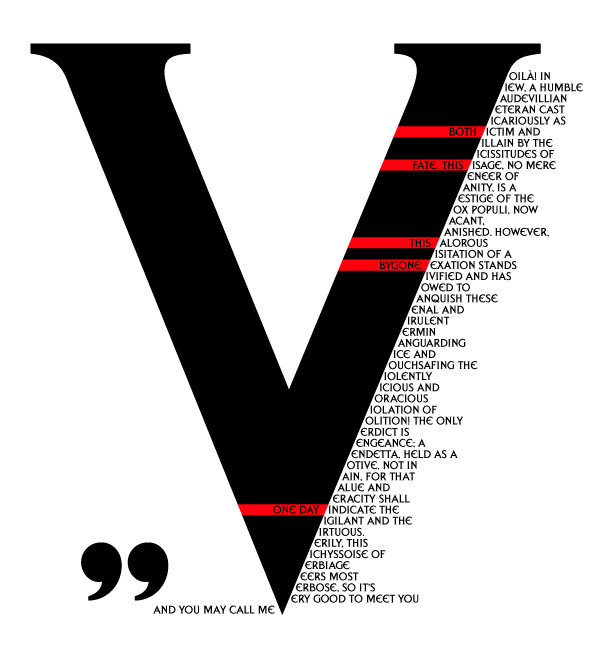
V for Vendetta is another cinematic favorite of mine, and this poster brilliantly utilizes the main character, V, and his famous speech in a visually appealing way. The large V takes up most of the space on the page, because V’s vibrant character is the main player in the movie. Because his speech uses words that start with V to emphasize the creativity of V’s character, this visual is stunning in its use of the starting V as the main V for all of the words in his speech. The red and black color scheme are his standard colors, for darkness and blood, but it allows for a pop of color against the dark black and white contrast. Also, the letter V is very balancing and captures the eye wonderfully.
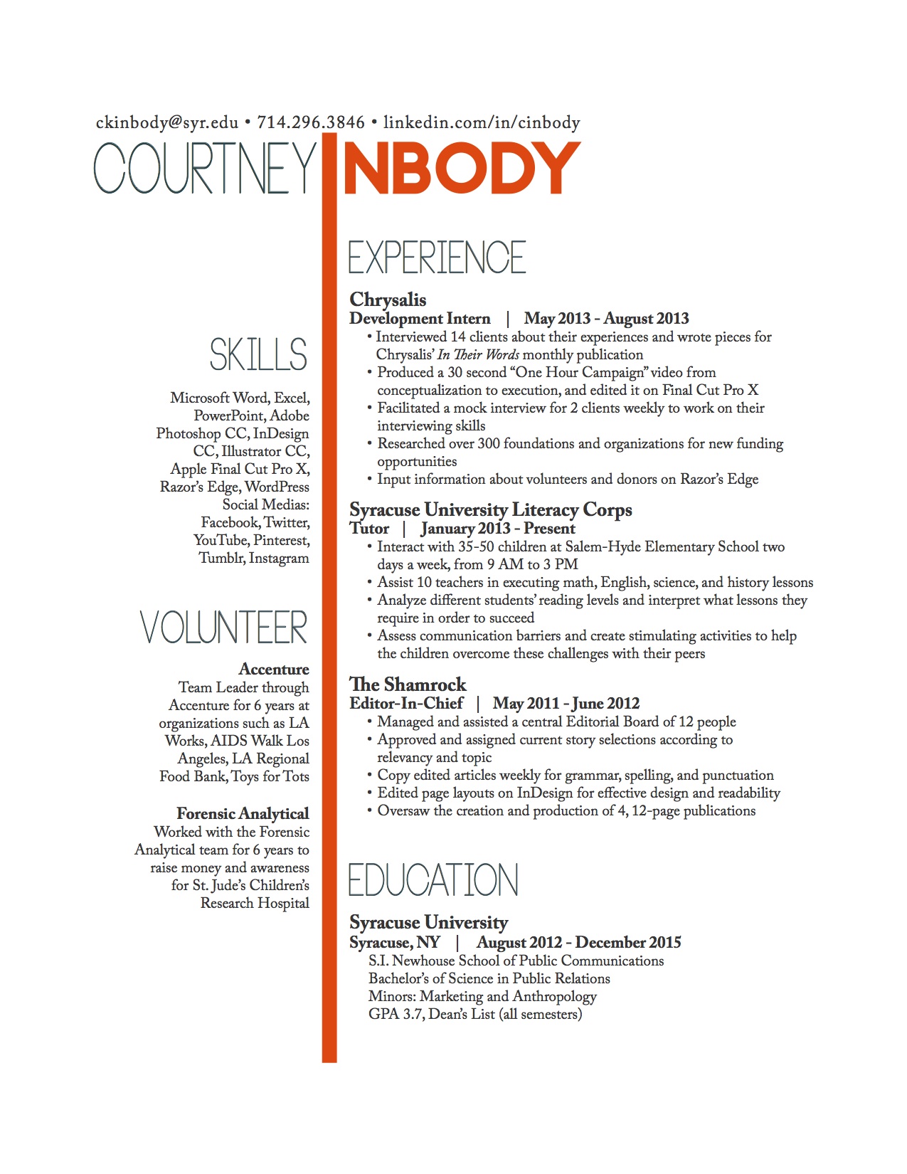
Inbody Resume
The Checkerboard Criminal
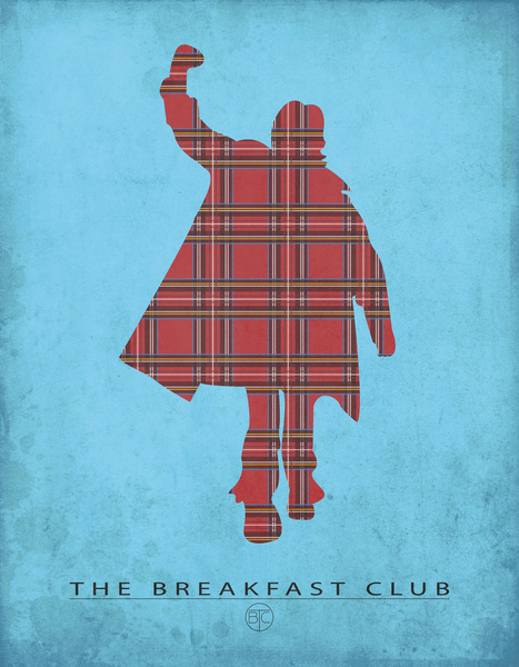
One of my favorite movies is The Breakfast Club, and this poster captures one of the prominent characters in an effective way, and also includes the logo of the movie, as well as the title. The contrasting colors of the blue and the checkerboard red pushes the classic pose of Judd Nelson to the forward, as the deep red is a warm color, against the cool blue background. The iconic fist pump during the ending scene of TBC to “Don’t You Forget About Me” is one of the most well known endings in cinematic history, so this poster effectively captures the entire theme of the movie – creating new friendships from different people that you never thought you could. Bender is the glue that keeps the club together, so it is only right to have him front and center. The checkerboard is his shirt, one of the other symbols of the movie. Overall, beautiful representation of the movie in a minimalist way.
Interesting and Bold
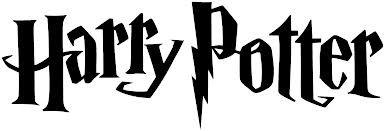
The Harry Potter wordmark uses the Harry P typeface, which was specifically designed to use for the series. The designers created the typeface with crooked letters and distinct serifs to illustrate the world of magic that Harry Potter portrays. The bolt image that extends from the P in this wordmark as a descinder brings the motif of Harry’s lightning bolt scar on his forward into the wordmark itself. Certain letters are larger than the others, and the H and the A, along with the P and the O are interlocking to place emphasis on the oddities and the other realm that the books and movies take the reader to.
![]()
The ESPN wordmark uses the ESP typeface. This is especially effective because of the type of magazine ESPN is, and the portrayal the editors want their audience to have of the magazine. The line going straight through the letters in a consecutive way illustrates a moving forward of sorts, or a type of action, as one’s eye moves directly across the image, from left to right, in a quick and fluid motion. The lack of negative space between the S and P elongates the word, keeping the word connected, as all of the sports and ideas within the magazine are connected as well, which is a great branding technique. The red is a warm color, keeping the wordmark in full view the entire time, making it stand out.