
Author Archives: Dominique Pineiro
America’s Navy
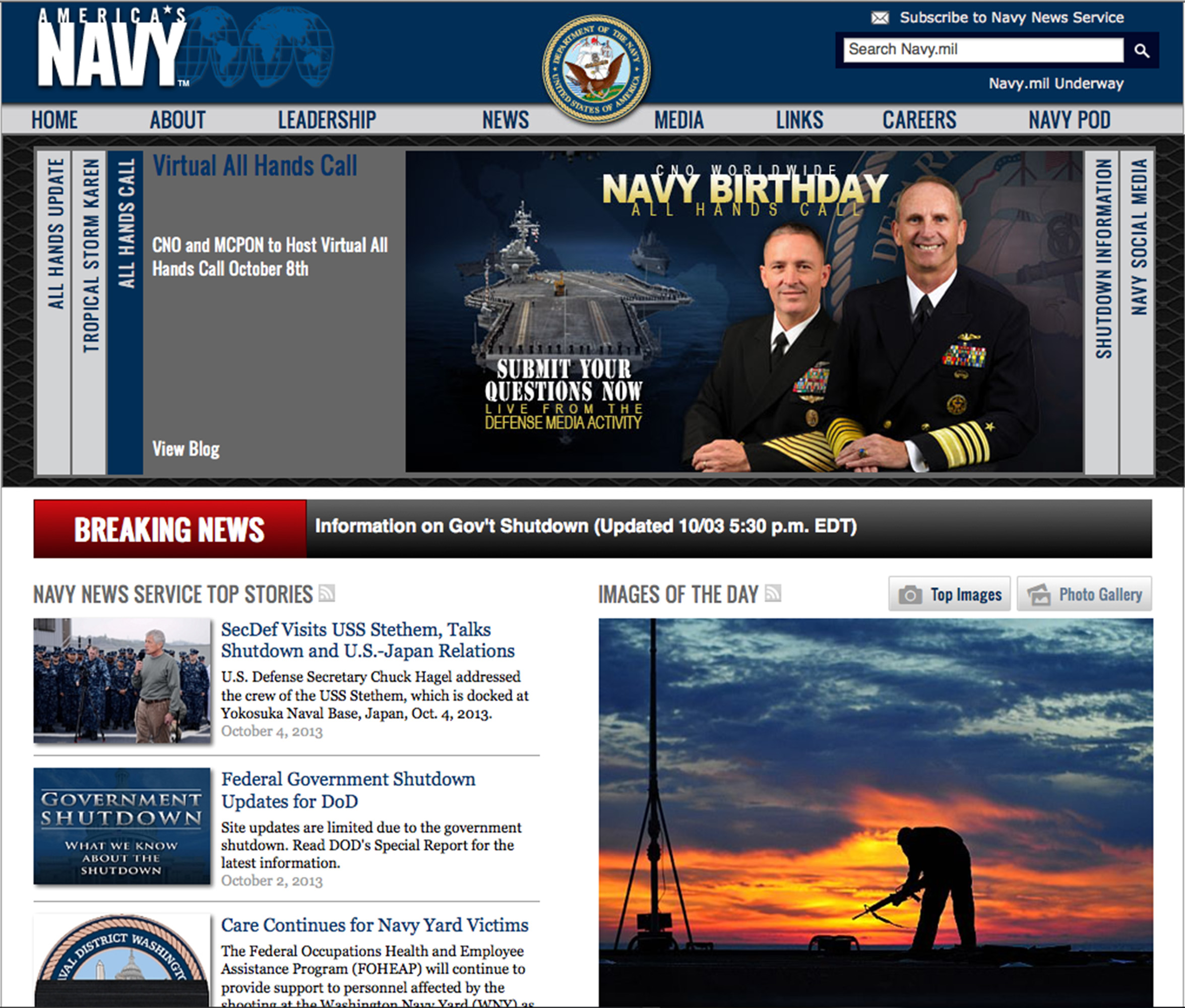
I like the visual hierarchy of this page. The arrangement of items leads you across the page from left to right, up and down in a very pleasing way. I also like the grouping of like items. It keeps everything on the page very neat and organized.
Atlanta Falcon
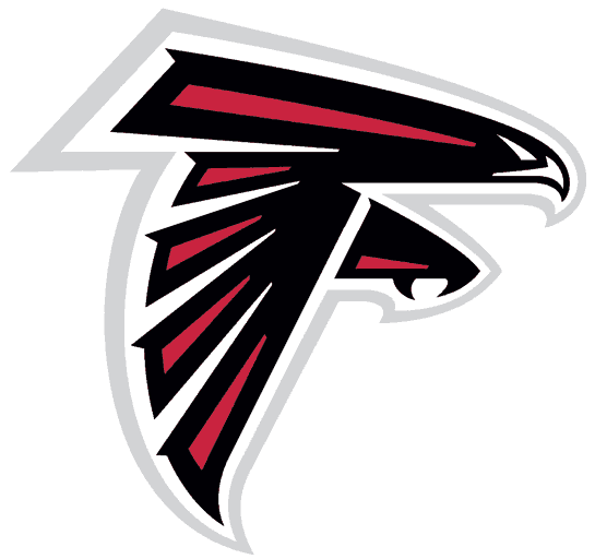
This fine piece of artwork was made with the pen tool. I’m also pretty sure the artist used multiple layers while making this. One separate layer for each color, and one for the shape of the white beak and eyes. It’s made with straight lines and bezier curves. It’s a straight forward layout, but it embodies the strength and power of the mighty Atlanta Falcon. If I were to recreate this, I wouldn’t. It’s already perfect.
Bauhaus?
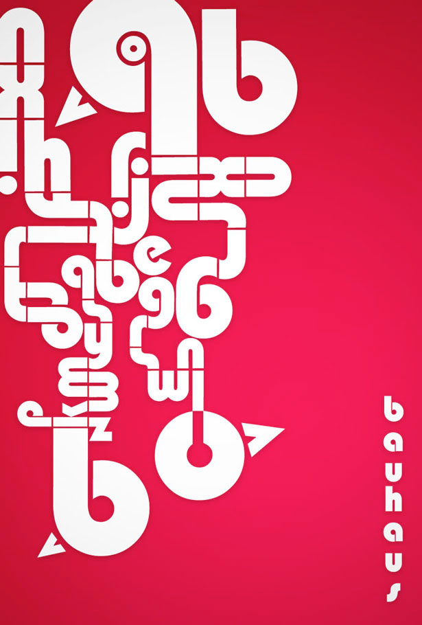
I’m not even sure what I’m looking at, but I love the way the letters are arranged. They create a maze like object and it leads you all around the image. I was drawn to this typography because of the use negative space. It’s heavy on one side, but I like the asymmetrical balance, it adds to the maze-like design. I think the color scheme is awful. I hate it. But other than the terrible colors I think this is a solid piece.
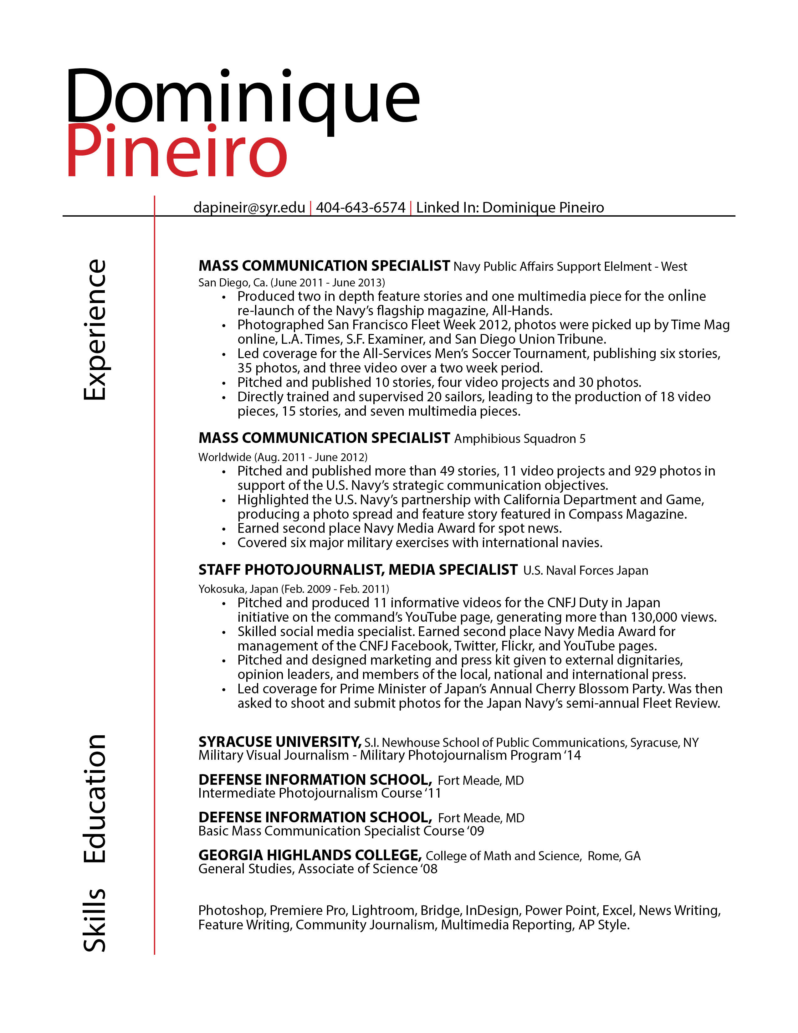
Dominique Pineiro Resume
This is Birdemic
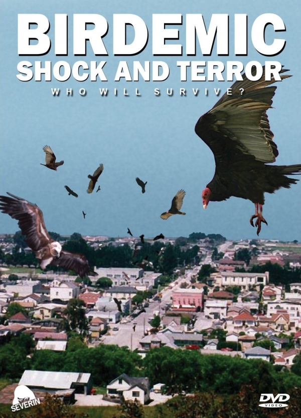
Everything about this poster conveys the look and feel of a “Birdemic”. The designer’s use of “Ariel Bold” for the title creates a sense of impact, and helps reinforce the film’s serious tone. One of the things I really like about this poster is how the designer created a “three dimensional space.” You’re not seeing just one element, but you’re seeing many elements and it helps tell the overall story. The way the birds are closing in on an unsuspecting sleepy town really creates a feeling of claustrophobia and terror.
Coca-Cola and Geico
Coca-Cola has a simple, easy to read, and distinct script typeface. Coke has been around for more than 100-years, and while their wordmark isn’t the most creative, it’s instantly identifiable with their brand. It’s important to note that Coke primarily uses a red and white color scheme, but because they have such a distinct typeface, it wouldn’t matter if they used black and blue or purple and pink.
![]()
Geico uses the Eurostile bold extended font. The designer made a font that would stand out on most layouts with bold capital letters. While the wordmark is nice and works well on a letterhead or a blank white background, it’s not that memorable. When people think of GEICO, they’re probably going to first think about the Gecko. It also appears that GEICO and Nokia share the same font.