
Author Archives: Jingai Xu
Web Design
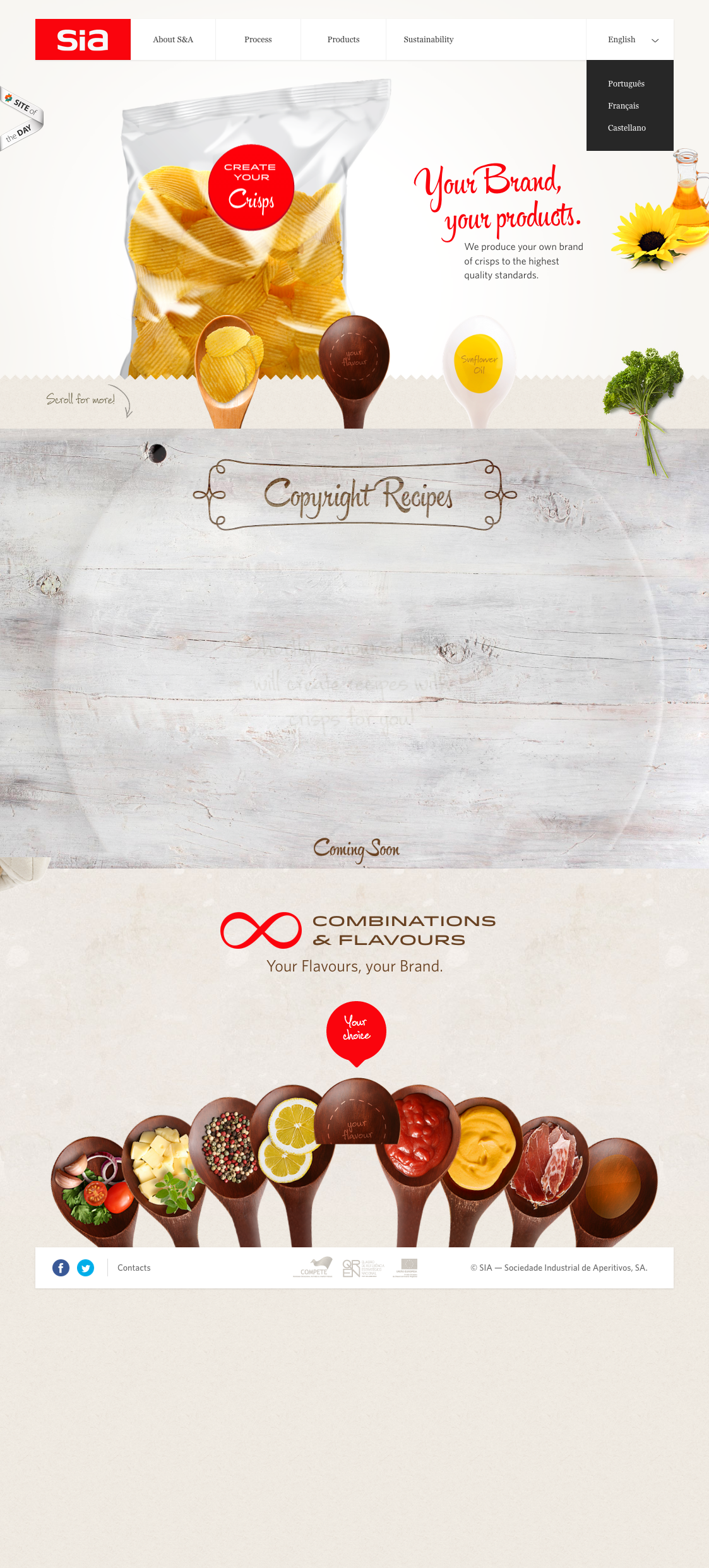
I personally like this web design very much. I think it is a good example of how Gestalt principle (similarity, continuation, proximity, closure and figure/ground) is applied.
For example, through the use of “containers” all in spoon shapes throughout the website, the designer nicely introduces similarities that make the website look very organized. The background color is clean, which makes objects in the foreground stand out. The website also uses very effective visual elements, especially the image of chips whose reflections add huge dimension to it and make it pop out.
I also like the typeface the designer has chosen, which looks really neat, clean and relaxing.
Week 5 AI techniques
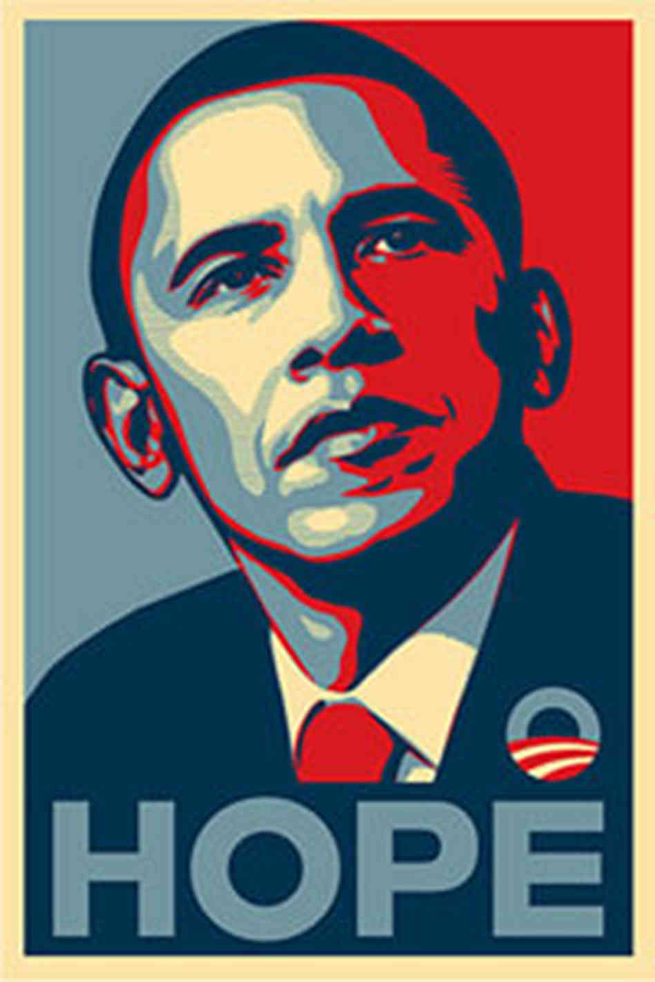
This is a poster of Obama’s 2008 presidential campaign. The poster is designed by Shepard Fairey. The artist used several layers to introduce a 3D effect. Tools the artist could’ve used include paint bucket, filters (to transform the texture from photo-alike to sketch-alike). The major steps for producing this poster would include setting multiple layers with each in different color, filtering, and using paint bucketing.
Week 4 Blog Post
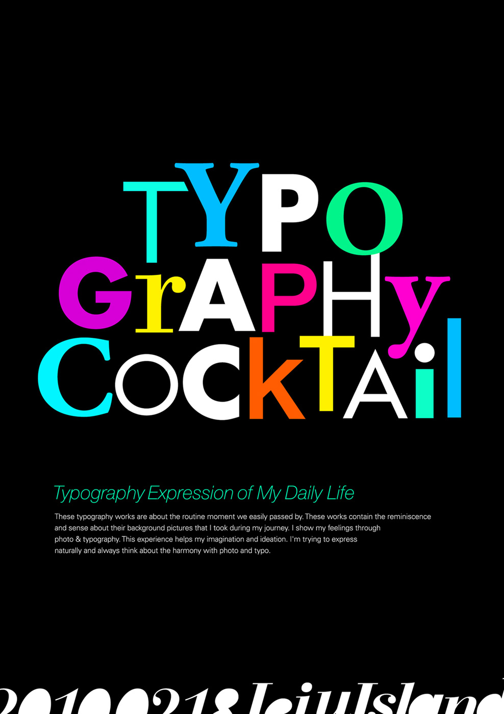
This design really stands out. Use of different typefaces and colors adds tremendous playful elements to it, making viewers link the playful design to the cocktail event unconsciously, which I believe is very very smart. Also, the designer chooses different sizes for each letter, making it even more lively. It’s fun to look at such design, as it spurs your imagination.
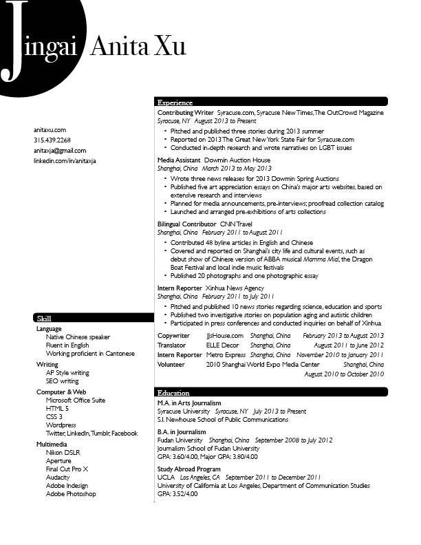
Resume project
Poster of The Prestige
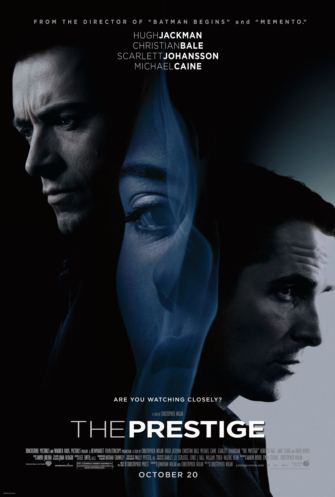
A mystery and thriller, The Prestige is one of my favorite movies. With a dark background featuring three main characters in the film, the poster highlights a creepy, mysterious and thrilling atmosphere the film is trying to sell. What impresses me is the women in the middle. Seeing from a distance, it’s hard to tell what the slim and cursive outline in the middle is: is it the woman’s hair, or smoke? Such illusion perfectly resonates with the mysterious tone of the film, and is further highlighted by the line “Are you watching closely?” I also like the all-cap texts on this poster, which make it consistent, serious and exciting.
Ferrari and Johnson & Johnson Wordmark
![]()
Wordmark of Ferrari is definitely an eye catcher. The white characters stand out from the red background, which makes the brand name more impressive and easy to remember at first glance. Tracking is natural and comfortable. The best of all is the extension of the letter “F” in the ascender line, marking its end with the letter “i.” Such design resonates with Ferrari’s brand image, as it is well-known for its super cars. The ascender line could have extended to “I”, but it doesn’t, suggesting that while Ferrari cares about the speed performance, it also emphasizes on the concept of “safe driving,” — to stop where necessary. Overall, this wordmark is well-designed and enhances the brand image.
![]()
This wordmark of Johnson & Johnson has both pros and cons. Tracking is moderately adjusted; letters are attached to each other, creating a fluid sense, which I think is very stylish. HOWEVER, I personally don’t quite get it why a company specializing in pharmaceutical and consumer packaged goods would come up with such a design idea. Shouldn’t such companies be more classic and traditional when it comes to wordmark design? What does this wordmark suggest in relation to its brand image? Any thought is more than welcome!