Website

Screen Shot 2013-10-03 at 6.26.54 PM


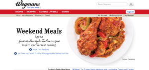
A Wegmans employee, I love this website because it is so easily navigable and is visually appealing. The white background with the red banner (a warm and visually eye catching color), makes this site simple yet attractive. The red banner pops but allows the bar to be visible where all information you’d need to find can be sourced by clicking on the links. Also, as you scroll down the page (not seen here), there are pictures different areas of the store you can click on and social media links, as well. I also like that the front image (of the chicken, here) constantly changes to different meal images, keeping it interesting and appealing. This is a great website.

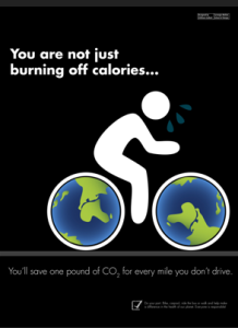
Save the Earth–Illustrator Tools

Screen Shot 2013-09-25 at 7.42.08 PM

This poster is very realistic and it’s successful in getting the message across to the audience. It appears to be done in illustrator, filling in the bike tires with the earth-drawn pattern, and the use of the pen tool to create the figure on the bike. If I were to replicate this poster, I would likely use the pen tool, draw two ellipses (using shift to make a perfect circle) and then increase stroke sizes for the tire rims to show the black, finally filling in the circles with the earth pattern created.

Typography -Blog 4

Screen Shot 2013-09-18 at 4.29.50 PM

I really like this poster. The colors drive one to get inspiration and move, with the red background. The typography is very playful and almost looks hand drawn to emphasize people have power and can change the world. The typeface is of the novelty variety and is very successful with the message it is trying to convey.

Rosie The Riveter Poster


Screen Shot 2013-09-12 at 10.26.55 PM


This is a poster that has been around since 1943, but became more noticed in the ’80’s. It is an American wartime propaganda poster produced to emphasize feminism and women workers in World War II. Now, many people know the poster as “Rosie the Riveter”, named after a female worker in the war.

I like this poster because it draws the eye from one end to the other effectively. When you first glance at the poster, you see the woman’s arm which directs you to the caption at the top of the poster. The colors are bold and allow the words to remain visible. I think the slab serif font style is successful in this case because it is easy and clear to read at a quick first glance.

The words in the poster “We Can Do It”, are supported by the woman displaying her muscles because she’s showing the public that woman are just as capable as men and “can do it too.” Also, the yellow background is so bright and strong, emphasizing the strength of the woman. I don’t believe there are improvements to be made here, I think it’s a very successful, well cherished poster.

Ebay and Jeep Wordmarks

ebay


The typeface of the Ebay logo, Univers 53 Extended, is an example of san serif. I think this is an effective wordmark because the mix of different warm colors not only capture the viewers eye but come off as fun too. Ebay is like its own community, attracting members from all over the world to sell items, so the mixture of colors is effective. I like how all of hte letters are lowercase, too, because it makes the font more playful. The letters are also simple and easy to read, with little to no space between them, making the tracking even. The kerning between letters is also very minimal, showing how close people from all over the world are and how one is able to order a product from Australia, with this online trading superstore.


Screen Shot 2013-09-05 at 8.08.33 PM

The Jeep word mark uses the sans serif typeface similar to Helvetica Bold. Jeep is a brand of cars that have been around for years and are known to be rugged sport utility vehicles. The army green font color works with the brand, reminding me of the outdoors and manly doings like hunting. It is a very simple font and uses even tracking space and kerning.The bold face reminds me of strength because these cars are built tough.