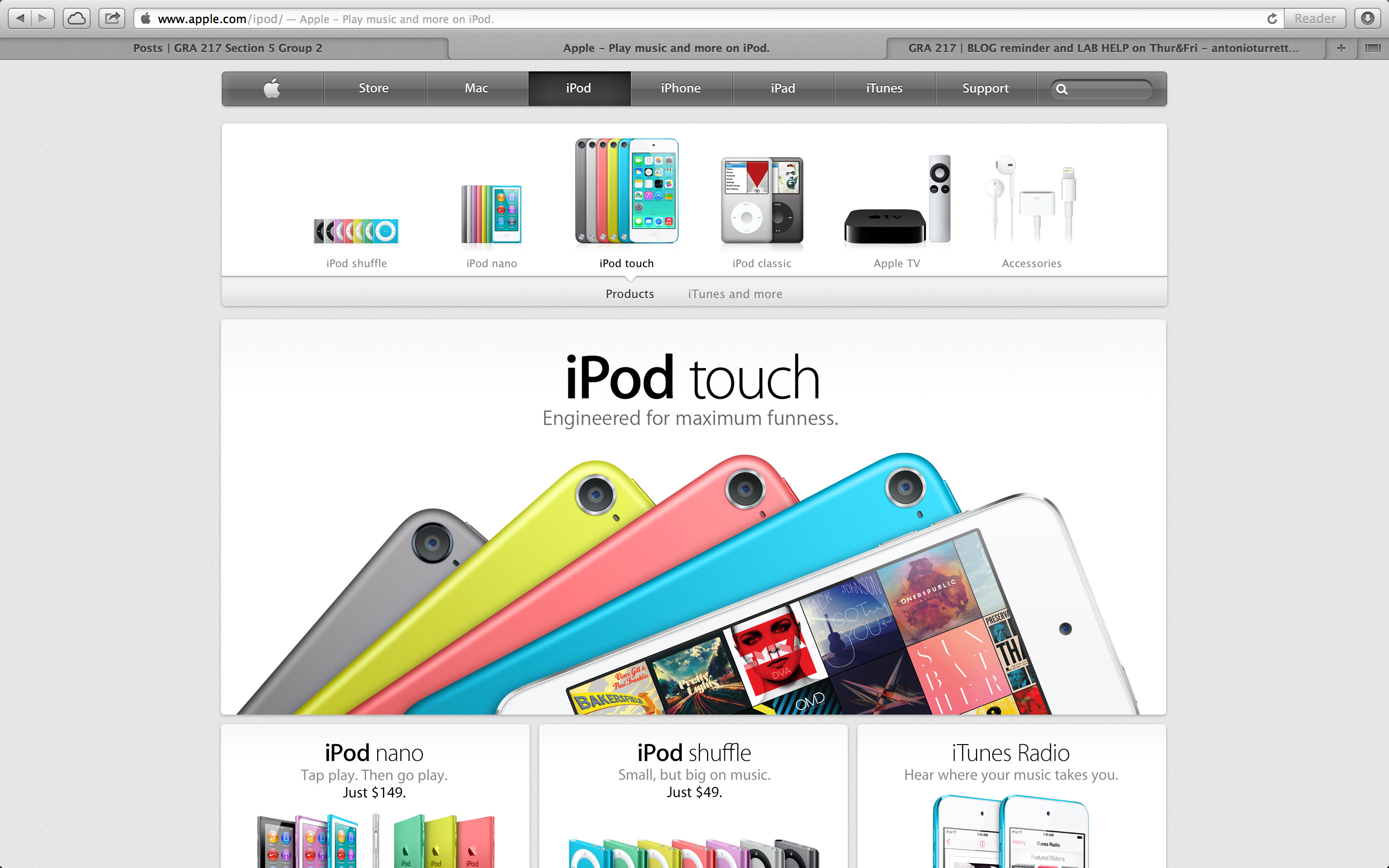
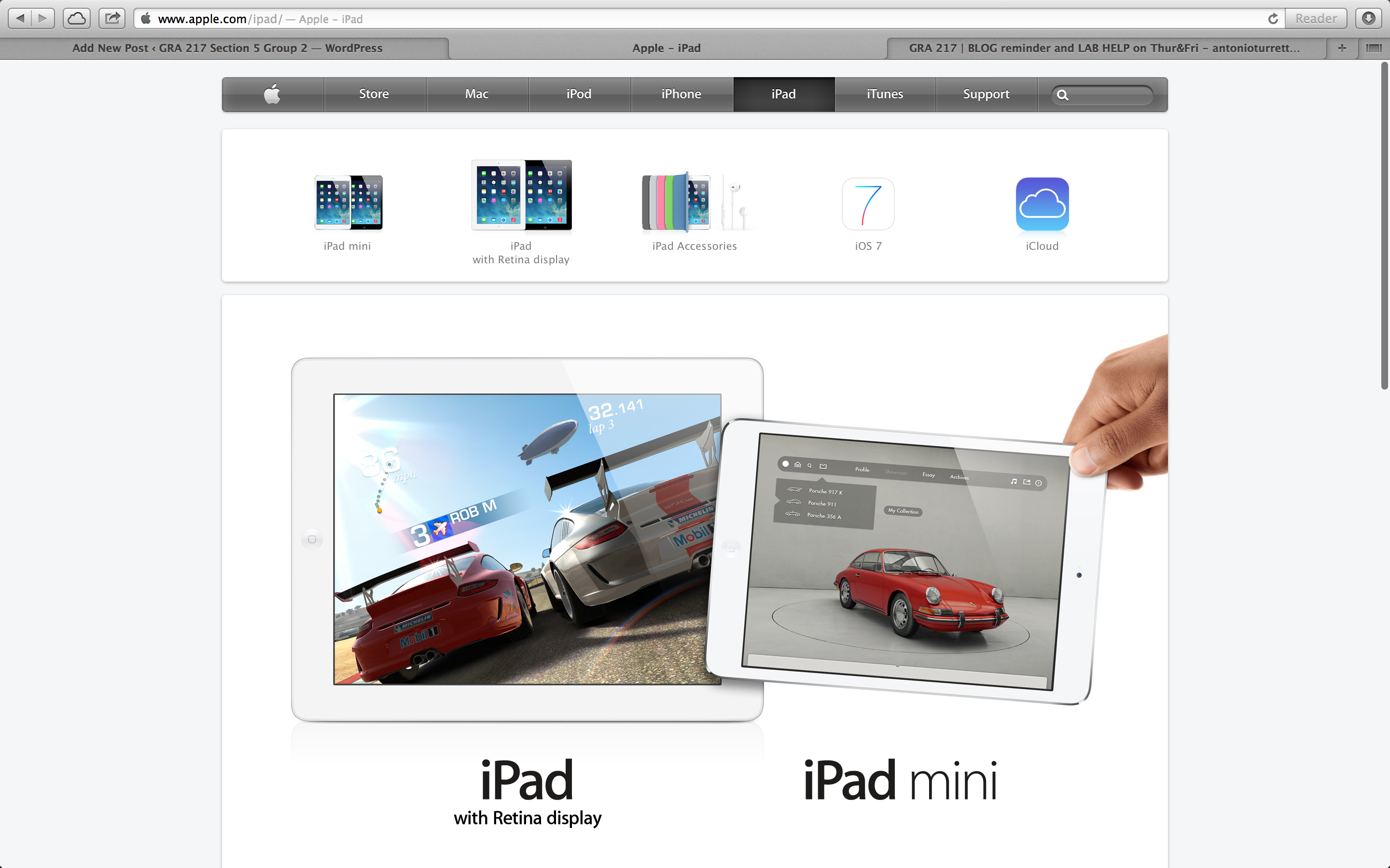
I really like the Apple website. It’s sleek and easy to navigate. It uses color and white space to make it simple and appealing. The photos used are sharp and crisp and always emphasize the product first. 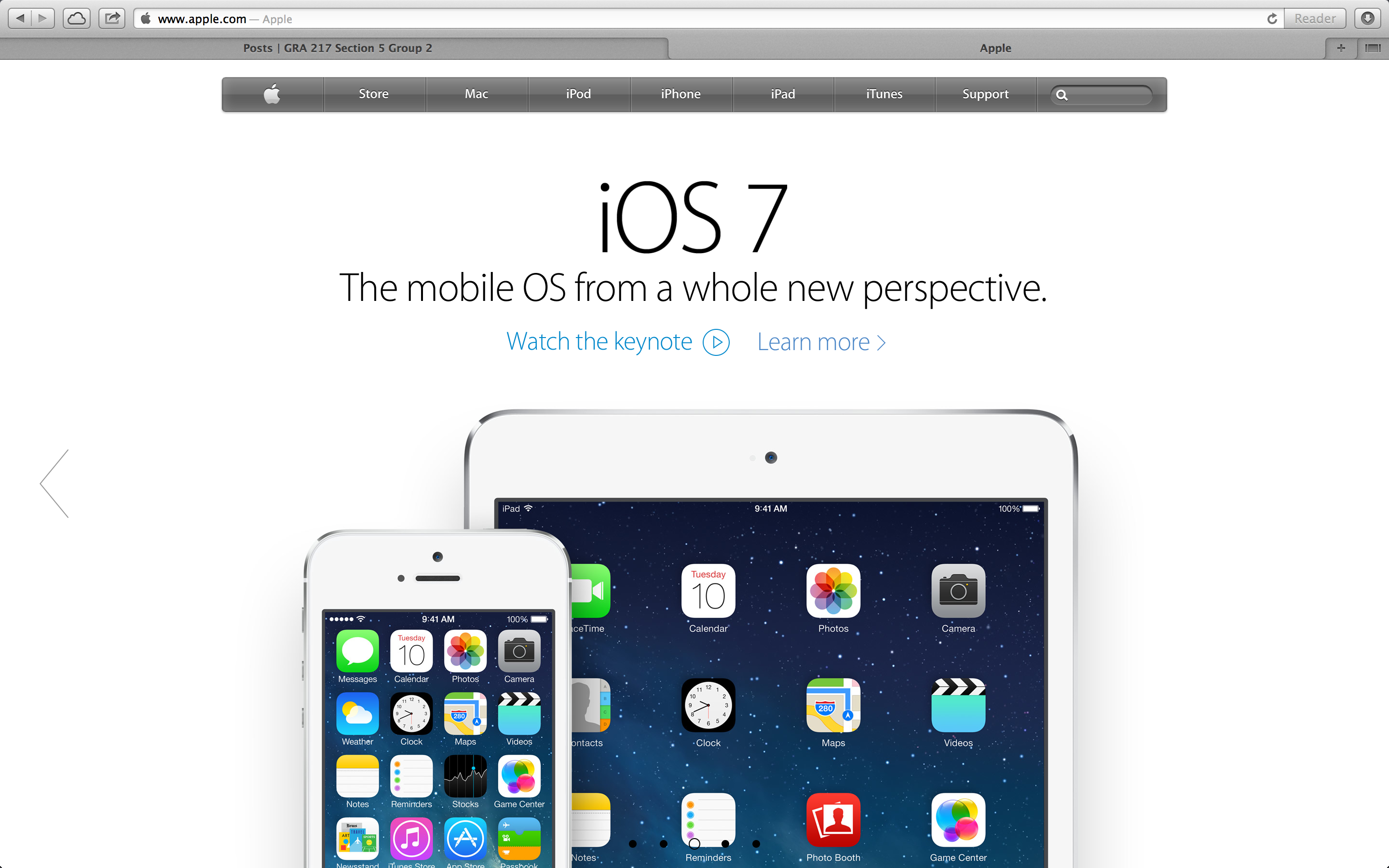
Author Archives: Antonio Turretto Ramos
Week Four Post – Illustration
This illustration of John Lennon was made using a combination of the pen, brush and gradient tools. When making illustrations like this you have to use multiple layers and change the stroke on the lines to get the nice shapes and harder edges that make this illustration work. What I really like about this one is the expressionistic use of color the artists take on how the light hits the subject. This piece was probably a trace from a portrait of Lennon, but I could be wrong. Either way avery nice piece in my opinion. 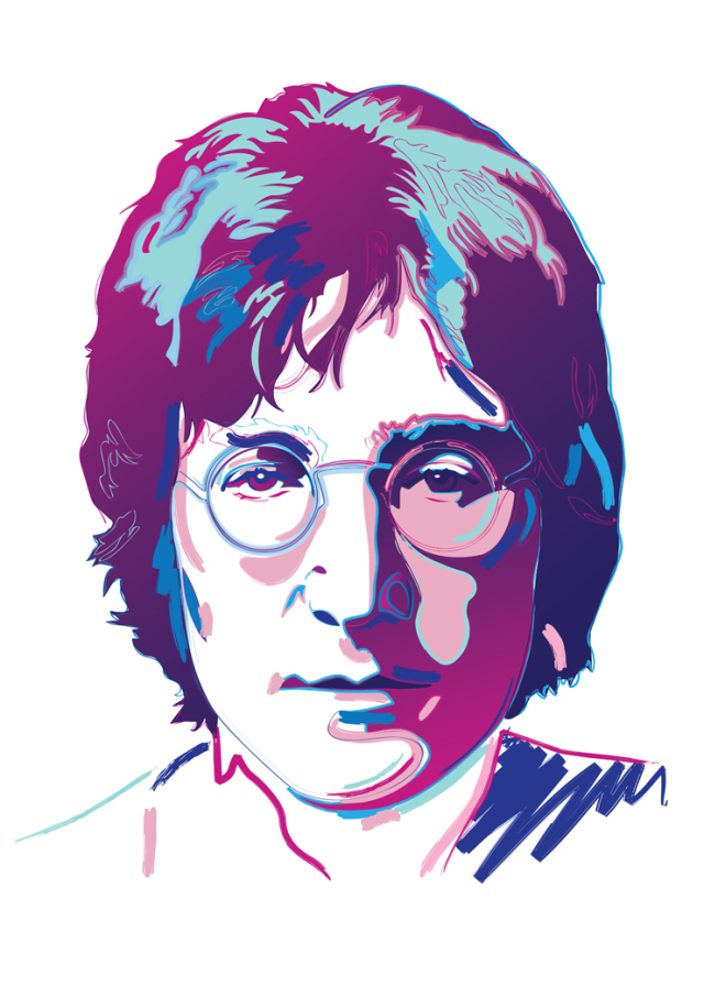
Week 4 Typography
I think this really demonstrates how typography can really drive home a message or theme. I think it’s really interesting how words alone from this image. The words are describing challenges faced in President Obama’s administration, and the image depicted shows the burden of leadership. I think this is a creative way to show how typography can be really powerful when different elements are combined.
Antonio Turretto Ramos
Week 3 post — Japanese Earthquake Relief Poster
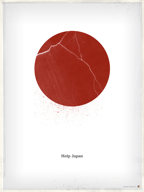
I really like this poster because it shows how well subtly can work when it’s executed well. The red circle in the symbol for the ‘rising sun’ on the Japanese flag and cracks represent the 2011 earthquake and tsunami. The typography is small and simple, but the message is clear and concise.The white space really adds to the simple effect and bold red color of the rising sun draws your eye in from a distance. I also like the dusty edges of the frame that break the white space evenly, but still everything is very subtle. The type, although small, pops because of it’s isolation on the page. I think the mix of powerful symbolism here and the simple message make the audience draw a conclusion very quickly about what the message the poster is trying to convey.
Tony Turretto – Wordmarks
I really like the Ray Ban wordmark because it has always been associated with ‘cool’. The wordmark, as most of you know I’m sure, is always neatly and subtly placed in the corner of all their products. I always thought that was neat because it distinguishes their product from similar ones. I like the bold color that draws you in, but I also like the the way they present themselves elsewhere using only the signature font. It’s unmistakable.
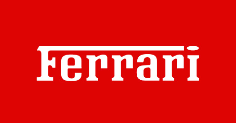
This wordmark is a classic. The font is unique but familiar and bold. I think the wordmark matches appropriately with the products it represents because of the bold color and sleek appearance. Unlike Ray Ban, Ferrari uses a block/slab serif that I find appealing because it’s bold and uncompromising. When I see Ferrari and Ray Ban wordmarks I think of classic and uncompromising brands that don’t aspire to be trend setters. These wordmarks and the associated products set the standard of what we know to be cool.

