SRCOM – Website Design

SRCOM


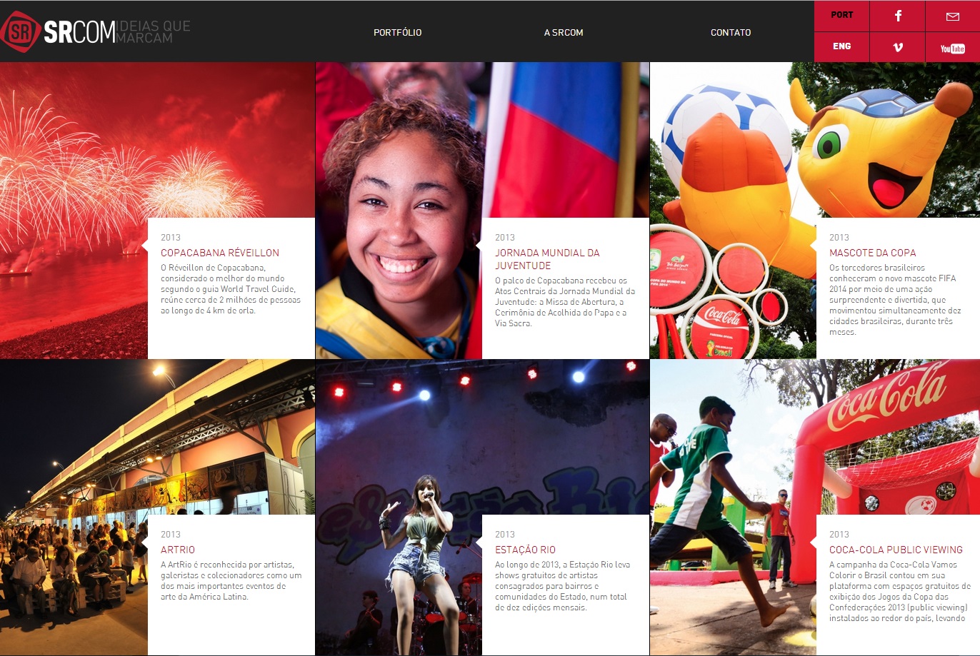
This website proves that web design is a universal language for communication. Despite being in Portuguese, even an English speaker can understand the importance of layout. Boxes may seem initially unappealing in regards to web design, but they can also be the most effective. In separating the text and emphasizing the important parts of the pictures, the web design has a successful visual hierarchy. The eye prefers visuals over text, and managing the layout greatly improves the viewer’s willingness to read the text.


Illustrator Techniques: Save Water, Save Life Illustration

savewatersavelifeThis illustration effectively identifies the disparity in water distribution throughout the world in one clever image. Yet how is it so effective?

In Adobe Illustrator and illustrating in general, perspective is key. Through applying multiple shades of color throughout the image and placing the words behind the illustration, there exists a sort of depth that wouldn’t exist otherwise. It is also important to note the figures within the hour glass and even the hour glass are simplified. There is very little detail in the shapes, but the shapes are recognizable. Most if not all of the shapes involved in the illustration can be created through utilizing the pen tool. There are other tools such as the gradient tool that can also provide shadow or a sense of light progression which can be seen in the faint aura behind the drop of water.

The most effective illustrations are not complicated yet discuss an intricate, complex idea. A simple hourglass is transformed into a potent metaphor of the water crisis that the world is facing.


Week 4 Blog Post

downloadI enjoy typography that not only is visually appealing but also can display another message. In this case, instead of simply typing out a country name, the typographer arranges variations of the country’s name to form a visual map of the world. The double emphasis of the name and visual representation hammers home the concept of national borders and national identity.


Dunkin’ Donuts and Ikea Wordmarks

Dunkin Donuts


When imagining a typical donut, the image in one’s head could (and should) be of a fat, perfectly circular (possibly iced) treat. Dunkin’ Donuts utilizes a rounded, bolded, sans-serif to achieve that image in their wordmark. Because the two words in Dunkin’ Donuts are perfect matches, it is effective to stack them. Through applying two different colors, orange and pink, Dunkin’ can also differentiate the two words, just like their two primary products – coffee and donuts.

IKEA

Ikea, on the other hand, brands itself through interchanging the same two colors as its home country, Sweden’s, colors. Sweden and Scandinavia have a reputation for quality modern furniture and by creating a connection to their company, Ikea connotes the same reputation as other finer Scandinavian furniture stores. It is also important to note the thick-bodied letters and the tracking between the letters. There are minuscule serifs on the edges of the letters that can also add more character to the wordmark.