
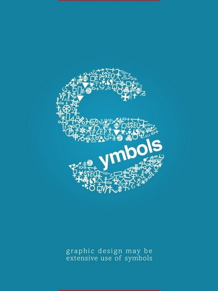
I really like the use of symbols in this typography. The font is interesting enough, and the fairly professional typeface along with the use of symbols to make the S in the word “symbol” is extremely creative and eye-catching. I also love the use of open space, with the placement of “symbol” in the very middle of the poster. The open space around the typography draws the eye to the center, and contrary to the rule or thirds, the placement of the typography works perfectly on this poster.