This picture could be created using only the pen tool. It would not be difficult, but it would definitely require a lot of patience. First, the actual petals would have to be drawn. Next, the dotted lines that radiate outwards would be drawn, and the setting changed from a solid line to a dotted line. The grid view would be helpful, because all of the intricate curves are proportionately spaced out. In terms of the colors, you would have to open the color palette and then use your mouse to drag the palette down and reveal the large-view spectrum. From there, it would be easy to experiment with slightly varying shades of green, blue and yellow.
Monthly Archives: September 2013
Illustrator
This strawberry would be very easy to make in illustrator by mainly utilizing the pen tool. First, I would create an ellipsis then drag down the bottom anchor point to create a more strawberry-esque shape. Then I would drag down the top anchor point to flatten the top. Then I would fill the shape with a red color. To make the seeds, I would create a smaller ellipsis then copy and paste the shape all over the strawberry. Then I would have to select portions of the strawberry to adjust the gradient to create the shadow that it has. In addition, I would use the pencil tool to draw the shape of the chocolate dripping off of the strawberry. Then using the ellipsis shape tool I could drag the anchor points to create the stem/leaves of the strawberry. Afterwards, I would use the pen tool to draw the shape for the stem of the strawberry.
Illustrator
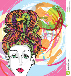
This image would be fairly easy to complete in Illustrator. The woman’s face can be used with the pen tool and making curved vectors and making sure that it’s not exactly perfect so it comes out slightly abstract. These curved vectors can be used for all part of the face. Even the shadows on her face can be made with the pen tool. Her hair can be made with drawing curved lines. The color in her lips and eyes can be used with the paintbucket tool and the color in her hair along with the color in the back are all used with the pen tool and making vectors. The very background color could be made with the shape tool. The colors’ opacity has been altered and the vector shapes overlapped to get a more abstract look.
Adobe Illustrator
This image was most likely done in Adobe Illustrator using primarily the pen, paint bucket, and text tool. The designer most likely used the shape tool to draw a rectangle for the background and then filled the shape in with blue using the color tool. The the designer probably used the text tool to write D’OH! in white. Having completed the backdrop the designer then probably used the pen tool to draw the outline of Homer and used the color tool to fill in the different sections of his face and upper body. The pen tool was also most likely used to create the details within the outline like his hair, eyes, shirt, etc. This image is simple yet conveys emotion very well and is a great representation of Homer Simpson.
Illustrator Drawing
What intrigues me about this image is it’s simplicity, but it’s ability to still send a concise and direct message. I can imagine that this image was made simply by tracing over an image of Darth Vader with paper and pencil and scanning it into Adone Illustrator. Then using the pen tool, the artist can easily draw over the image and add the additional details to Darth Vader’s face. Once the image is complete, it would simply be a matter of chanjng the pen’s color to grey and adding whatever text is needed at the bottom. The logo could simply be added by drawing it with the pen tool in a grey color scheme. With those simple tools, the image is completed and sends a clean, concise message.
Adobe Illustrator
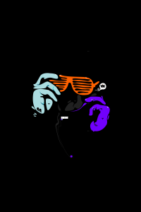
This is a piece of art that was created in Adobe Illustrator. From my perspective, I believe that this image was created with the pen tool. It particularly catches my attention because the lines are not straight, but curved to give off the idea that this image was hand drawn. Furthermore, the use of the black background makes the other three colors of the image pop to the viewer. Overall, this image is extremely well done.
Adobe Illustrator
Here’s an image that was created in Adobe Illustrator. The whale could’ve been drawn with the pen tool or had been an original image that was recreated using the trace tool. The same applies to the birds. However, the artist only needed to create one bird and then the bird could be copied and pasted and mirror flipped to create multiple identical birds. I imagine the waves were created that way as well. This image just involves heavy use of the pen tool and active paint bucket. I think this is an awesome image, personally.
Week 5 Illustrator
 This image looks like it used both the pen and circle tools to create this flower, with a lot of gradient coloring used to fill it in. the color swatch palette might have been used in the center of the flower. The leaves and flower petals look to have a yellow stroke around them to to separate the flower from the white space. The image can be completed in illustrator, But coloring looks lIke it can be done in Photoshop as well.
Adobe Illustrator
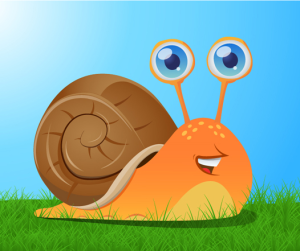
This image of this snail was probably created using a variety of tools in Adobe Illustrator. The basic shapes, such as the orange snail body and the brown shell, were created with the pen tool, focusing on curved lines. The gradient tool was used for the orange fill, since the color is lighter on bottom and darker on top. The ellipse tool created the small yellow ovals on top of the snail, and possibly the larger half-ovals near the grass (these ellipses were just trimmed in half). The pen tool was used for the orange part of the eyes, and the ellipse tool was probably used for the silver and blue part because the circles are nearly perfect. A blue gradient was used in the eyes, and light ovals created by the ellipse tool inside of the eyes create dimension and light. The pen tool was also used to create all of the small details (like on the snail’s shell and its mouth) and the paint tool was likely used to fill everything in. Since the snail was created with Illustrator, it looks imperfect. However, the imperfections make the image appealing.
Illustrator Design
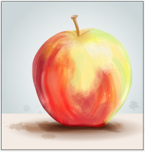 The effect used to create this apple image is very interesting because it looks like a painting, however was just done on illustrator. To do this, you would trace the outline of the apple with the pen tool, then create a bristle brush with the brushes panel and choosing the round fan option. Adjusting the opacity of the brush tool gives variation in the strokes. By overlapping the brush strokes there will be different saturation of color, while changing the color of the stroke to create the multiple colored effect the apple shows. You can paint in white for highlights on the apple to show a 3D effect. I believe you would either delete the image of the apple before painting in the colored strokes, or decrease the opacity so you have a reference to go off of. This whole effect was done with only a few tools on illustrator and gives an image a whole new look. This look is very loose and light and is visually appealing because it resembles a painting.

