


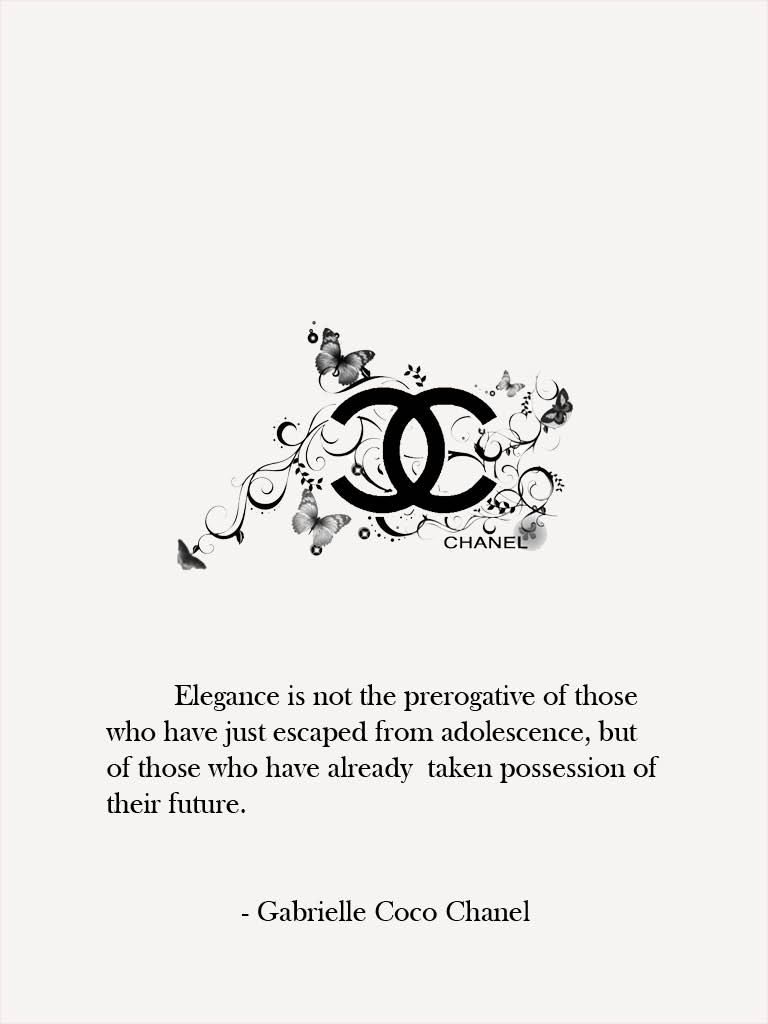

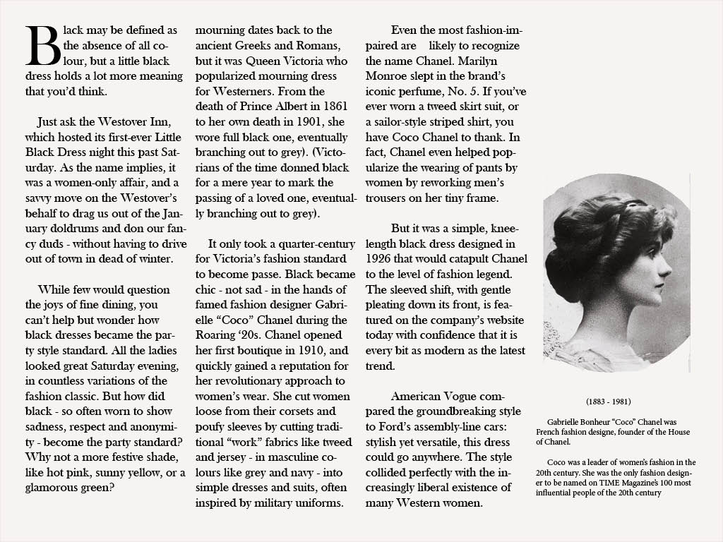

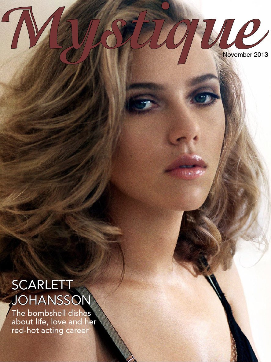


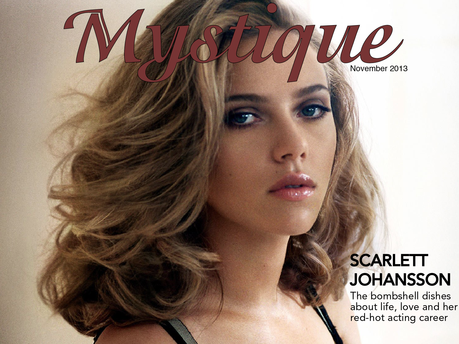
From this assignment, I learned the difference between magazine design in print and on tablets. Tablet magazine covers often have fewer (if any) cover lines. Cover lines exist to sell the magazine to the reader, but tablet readers have already bought the magazine and therefore don’t need to be convinced to buy it. Tablet covers often only have an image and the magazine’s name. Also, magazines have unlimited space on tablets so the designers can space out the type by adjusting leading and put fewer elements on each page. Interactivity promotes reader engagement, and allows designers to fit more content on the pages.
The main thing I learned with this iPad design was to be patient with learning new Adobe software. I prefer Photoshop to any other program, but this project allowed me to be a lot more hands-on with InDesign than the resume project did. Though InDesign is still not my preferred program, but I am lot more comfortable with it now than I was back in September.
Yesterday I had the opportunity to visit the Shaffer Art Gallery and spend some time looking at the history of printmaking. It was very interesting to see the styles and sophistication evolve throughout the years. The images began with mono-color wood engravings. These images were very detail-oriented and the talent that was involved in creating those pieces was very clear. After the mono-color era of printmaking, there were two-color linocuts and lithograms. These images were more involved and it was clear that the artists began to experiment with the color and where to place the color in the image so it’d be most effective. Eventually, printmaking developed into tri-color and more detailed images. These images were more advanced. It was also clearer from these images to see the progression from the tri-color lithographs to today’s design principles.
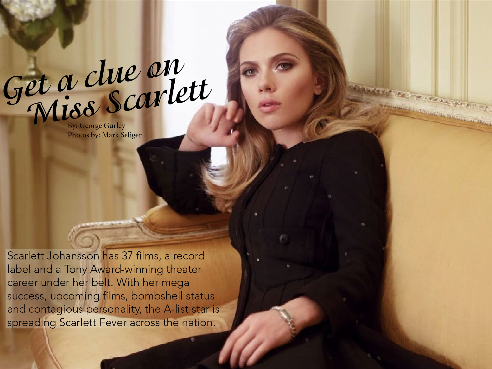
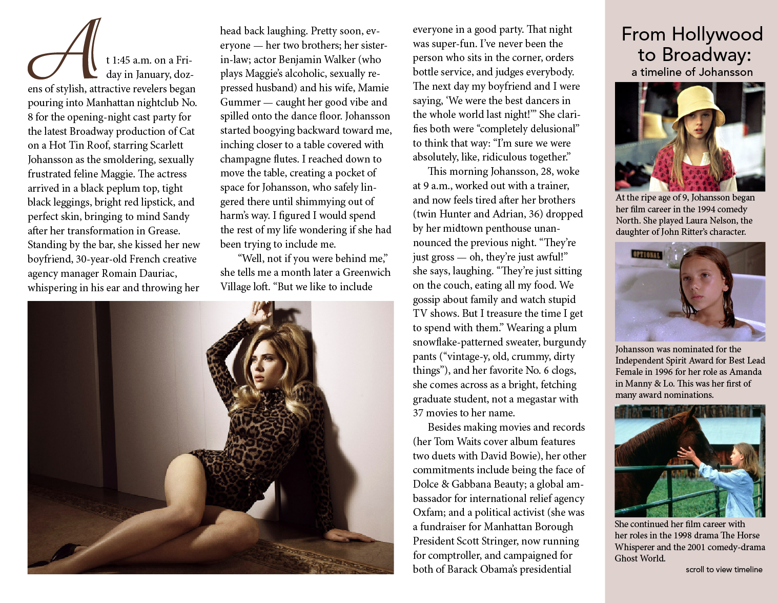
Through working on this project I guess I just came to understand that space on an iPad (or any digital surface) is infinite. It’s not like a newspaper where space is the be-all-end-all dictator of content. You can make things as big as you need or even just as big as you want them to be. So when I was designing my pages I tried to keep that in mind and just make everything big and spread out. Places where I would’ve mushed things closer to save space on previous projects, I left spread out on this one. This is also the first project where I’ve dramatically increased the leading for body text. I thought the most important part of this was to have the pages look inviting and not at all overwhelming, I think I was able to do this by taking advantage of the endless amount of room that iPads offer.


 I learned how to art direct according to a magazine feature, as well as how to incorporate different interactive elements.

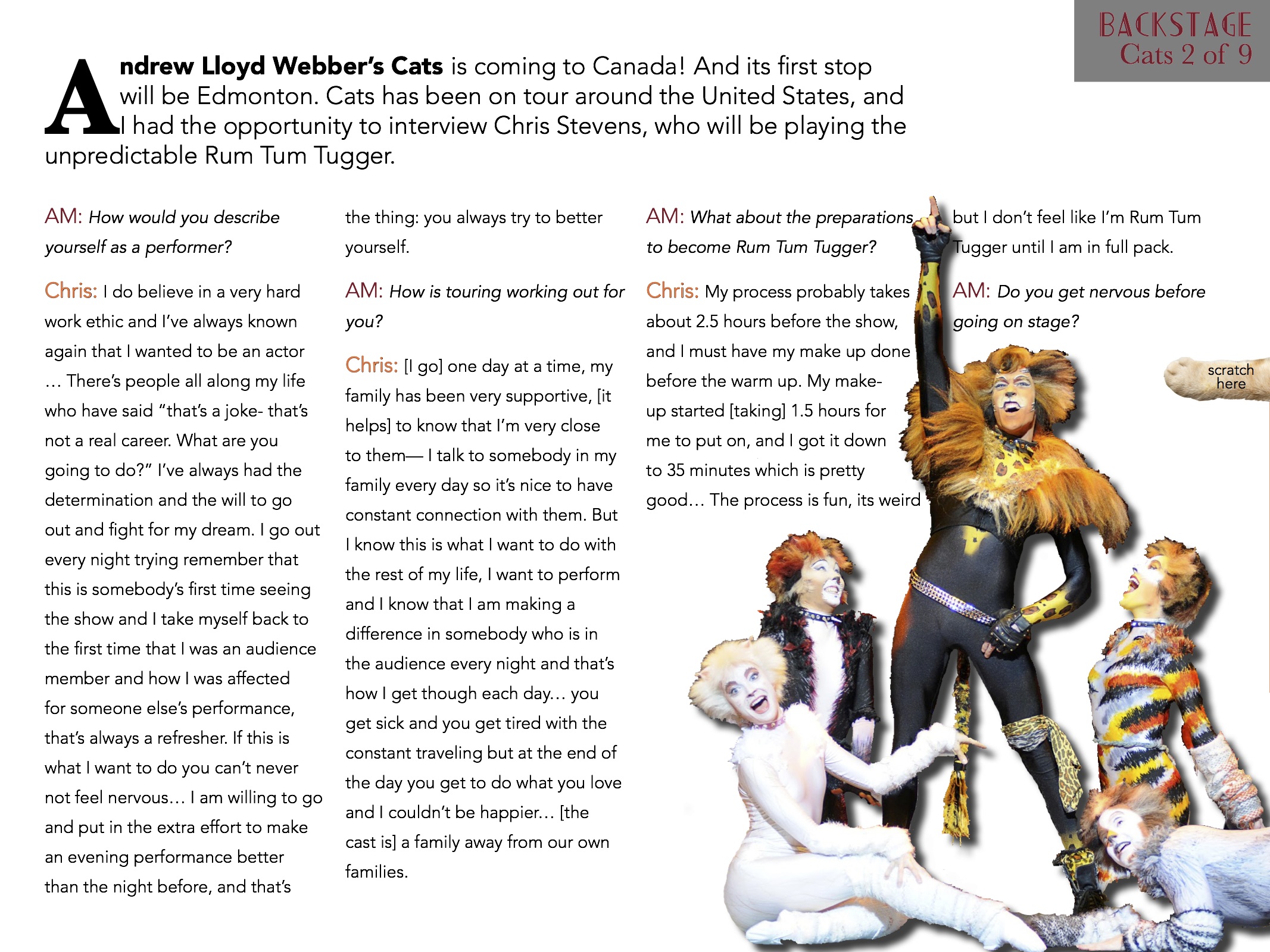


During this project, it was definitely good to learn about the interactivity feature of InDesign and know that those features are there. I also learned a lot more about InDesign and the tools that it has by doing the resume and this project in that program.


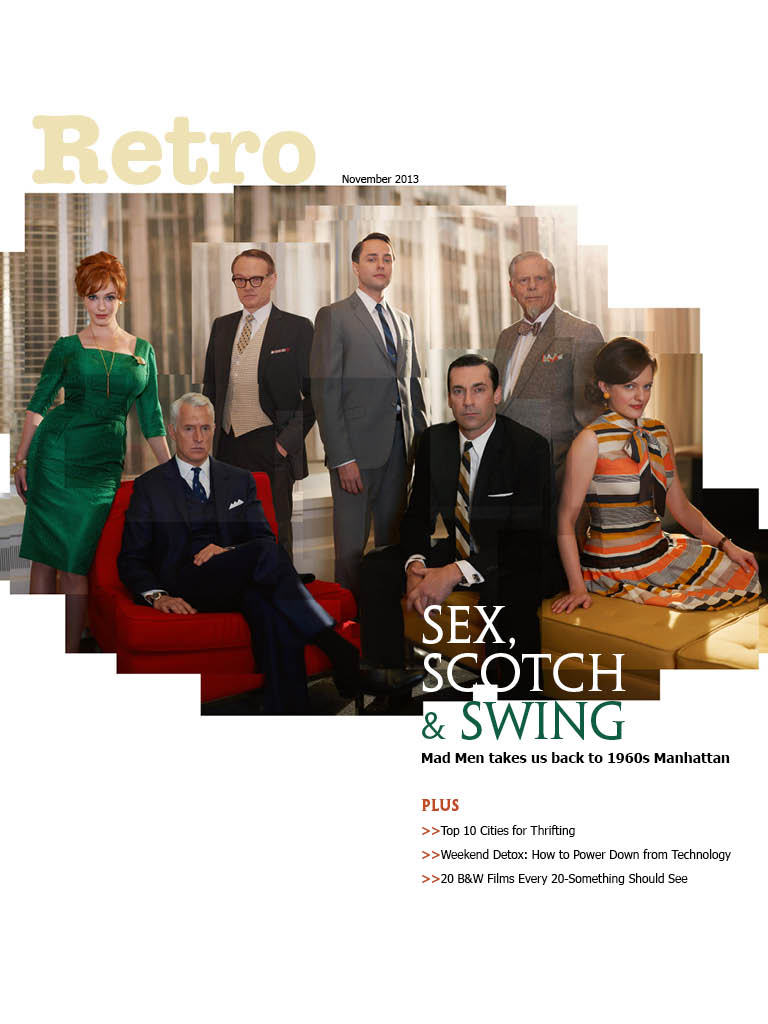
This is my iPad magazine design on a car magazine specifically oriented towards the drifting car culture. The magazine is called SIDEWAYS.