website.

3 2

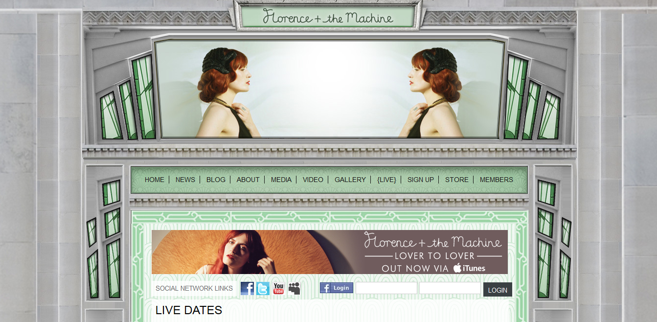
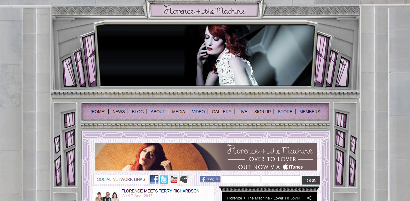
Florence + the Machine has a very aesthetically pleasing website. I like the 20’s/art deco style of the web design. It correlates with Florence’s actual fashion style. The website includes very dramatic and quality photographs of her. The colors of the windows and the photos at the header change while you are viewing the page. It is very clear and easy to navigate. I believe that many artists and bands have really nice and quality websites and Florence + the Machine is no exception. http://www.florenceandthemachine.net/index


illustrator.

alaska2

This is a Alaska travel poster made with Adobe Illustrator. It is a very linear design, so I assume the designer used the line segment tool to create the mountains, trees, tent etc. They probably used the arc tool to create the lake, the island, and any other rounded objects. I am sure the designer created only one mountain and one tree and duplicated them and changed the colors. They added dimension to the mountains by adding highlights and shadowing just by making one side of the mountain a darker shade of blue. They also made the mountains and trees in the background smaller and with less detail to create depth. They cleverly positioned the mountain peaks to be the “A”s in Alaska. The other letters were created with the type tool and given dimension with the dark shading behind them.

Typography.

Print

This poster cleverly uses typography to give the essence of motion. I like how it is a recognizable figure yet still abstract. It effectively uses the type’s size to create form, especially the very small type to invoke speed. The design is simple and has nice contrast against the yellow background.The giant “O’s” as wheels draw the viewers eyes in but do not distract from the whole image over all.

Poster.

i_want_you_for_u_s__army_rst__n_by_adamcuerden-d32aw9u

I believe this is one of the most famous posters of all time. Everyone has seen this image and there have been countless parodies of it as well. It was created during WWI as propaganda to recruit soldiers for the American Army. Uncle Sam is depicted pointing at and staring into the eyes of the viewer, drawing them in. The use of an iconic figure (Uncle Sam) and the choice of the red, white and blue colors make it very patriotic. Uncle Sam personifies the United States and is a man associated with the qualities of fairness, reliability, honesty, and who is devoted to his country. The “YOU” is the most prominent word. It is larger than the rest and a different color, which again draws the viewer in. I believe this poster connects to the viewer in a very personal way (especially emotionally). This poster was so overwhelmingly successful that it was later used in WWII.

Wordmark.

The_Star_Wars_Logo_Wallpaper_JxHy

Star Wars is one of the most iconic and recognizable “perfect” word marks. It is a custom made typeface which was based on a Helvetica Italic font. The sleek lines and flowing script give it a futuristic appearance. The yellow colored lettering stands against the black (galaxy) background giving it depth and a sense of unknown. The combination of the elongated “S” and the “T” as well as the “R” and the “S” add a distinct and memorable quality to this word mark.

lego-logo

Lego has a very fun and playful word mark with bright colors and a relaxed typeface which appeals to children. The word mark has close or tight kerning which correlates with the actual stacking of the Lego blocks. The Lego word mark has evolved over time to its present day simplistic, digital friendly design. http://lego.wikia.com/wiki/LEGO_logo