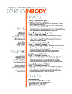
This class taught me that the little legs on letters means that the font is a part of the serif family, and without legs means sans serifs (without serifs). I thought that was pretty cool. I also learned how to do cool things on InDesign, because I hated InDesign before this class. But now I know how to put a scrolling tray on a layout, or use hyperlinks properly. I also learned that jeopardy is intense and if you don’t pay attention in lecture or keep your notes, you won’t know the answers, like what typeface Volkswagen used to use. I created an awesome resume and learned what analogous colors are. Basically, the ins and outs of graphic design were taught very well in this class, and I am definitely more graphic savvy after this class. It’s been real. It’s been fun.
Author Archives: Courtney Inbody
Cap iPad
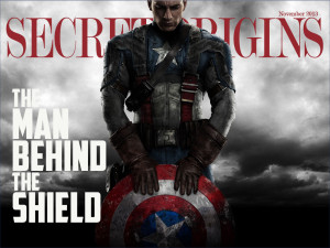
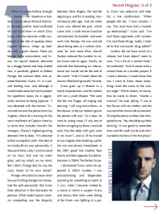
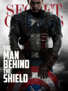
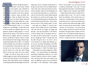
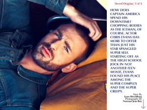
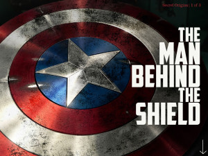
I learned that you cannot do any project with a subject that you do not like or are not interested in. Therefore, you’re welcome for Chris Evans, aka Captain America. Secondly, I learned that InDesign is irritating and doesn’t like to hyperlink properly. Third, I learned how to use a tiny box to keep my pull tab in place. Go me – or go whoever did the tutorial that showed me how to do it.
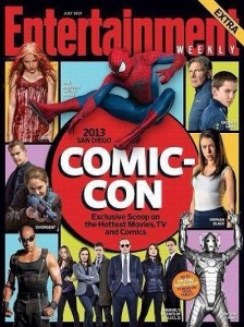
iPad magazine – EW
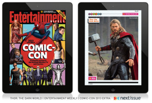
There are slight differences on the iPad magazine cover and the actual magazine cover, like the orange circle that says “Go to ew.com/digitalissue to read on your tablet!” because obviously, you would not need that if you are reading the magazine on an iPad. Everything else, however is the same, just scaled down for the size of the iPad. Stylistically, the red circle matching Entertainment was a bold move, and is smarter than using one of the other square colors as the color of the nameplate. The cut outs of the characters of each movie and show with the different color background adds to the effect of the “comic” portion of Comic Con, as it started as a comic convention.
Headline & Deck
Headline: Marvel at the Possibilities
Deck: This year’s Comic-Con in San Diego gave Marvel fans plenty to talk (scream) about. The next three years are action packed with the releases of Thor: The Dark World, Captain America: The Winter Soldier, Guardians of the Galaxy, and Avengers: Age of Ultron.
http://insidemovies.ew.com/2013/07/20/marvel-captain-america-thor-guardians-of-the-galaxy-comic-con/
ESPN Body Issue
I have always loved ESPN’s Body Issue – the photos are stunning and represent what it truly means to be an athlete in such a diverse world. Since the photos take up the entire space of the spread, the dominance is placed on the athletes. The type is simple and informative, adding to the accomplishments of the people featured. Leaving the text small and in one specific corner keeps the focus on the human body and the amazing things humans can push them to do. Oh, and Kaepernick is (a) damn fine (quarterback).
Inbody Website
CKI logo
I created my logos on photoshop – seemed easier. Yes, I have a thing for butterflies. Yes, I have a thing for bright orange and turquoise-y blue. Therefore, here you go! I like the simplicity of combining the letters with tight tracking, and I have always been drawn to lowercase letters – they seem more inviting. I think I like the bottom one better, because the i and b are attached, and allows for the creativity of my last name and my personality to come out. Both of these would be put on a vertical business card, if anyone was wondering.
TWLOHA
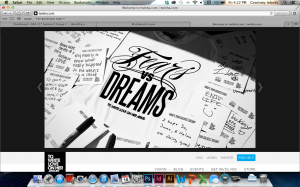
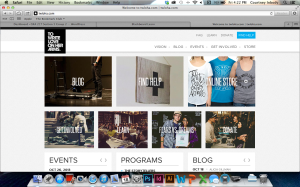
To Write Love on Her Arms is a campaign designed to allow anyone to express themselves as the wonderful individuals they are. TWLOHA aims to help people who are struggling with depression, addiction, self-injury, and suicide. Photography has always been a large part of this website, specifically because images of self harm, in any form, were used to encourage this sort of harm by others, and TWLOHA tried to be the movement to stop that. The black and white color scheme, and image at the top of the page, serves to provide a striking contrast to the world of color that we live in. Sometimes, dealing with any type of harm, can be seen as black and white, and the color that brightens a day has to be found by one’s support system – the point of this movement. The rest of the pages throughout this website are coded to an image, and the images have something to do with that specific page.
Inbody Redo
Hulu. Who Knew?
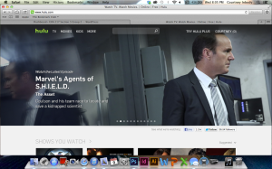
Thinking about the gestalt principles, and because I just had a viewing party of SHIELD in my room 3 hours ago, I decided to use Hulu as my website. Who knew Hulu would have used these principles? Anyway; seeing as these are all video clips, the images themselves stand out against the grey background that Hulu uses on its website. Through all of the clips of what is new that aired this week, the same font is used for the title of the show, the name of the episode, and the description beneath it. The headers of each section, such as “Shows You Watch,” are all the same font, and are all capitalized, creating uniformity. Finally, visual hierarchy is very much used, as the episodes just coming out the day after they air on television take up the entire top half of the website, being the first things that you look at, such as Agent Coulson’s face (#CoulsonLives).

