
Author Archives: Dena Skeadas
David’s Refuge Gestalt Principles
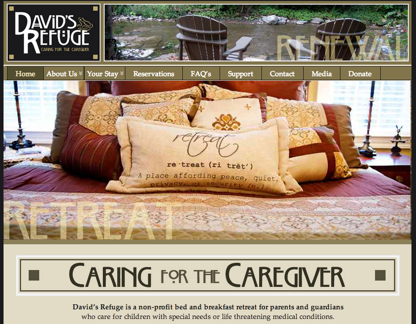 This designer of this website had gestalt principles in mind as he or she was designing. For one, there is figure and ground because the image of the bed stands out against the tan and dark green backgrounds surrounding it. In addition, there is proximity and alignment because the designer used the same typeface in the David’s Refuge logo and in the “Caring for the caregiver” tagline. Furthermore, there is continuation because the faded words “Retreat” and “Renewal” are placed on lines, which indicates continuation and connectedness. Lastly, there is visual hierarchy because the image of the relaxing bed is the first and most important thing that my eyes look at.
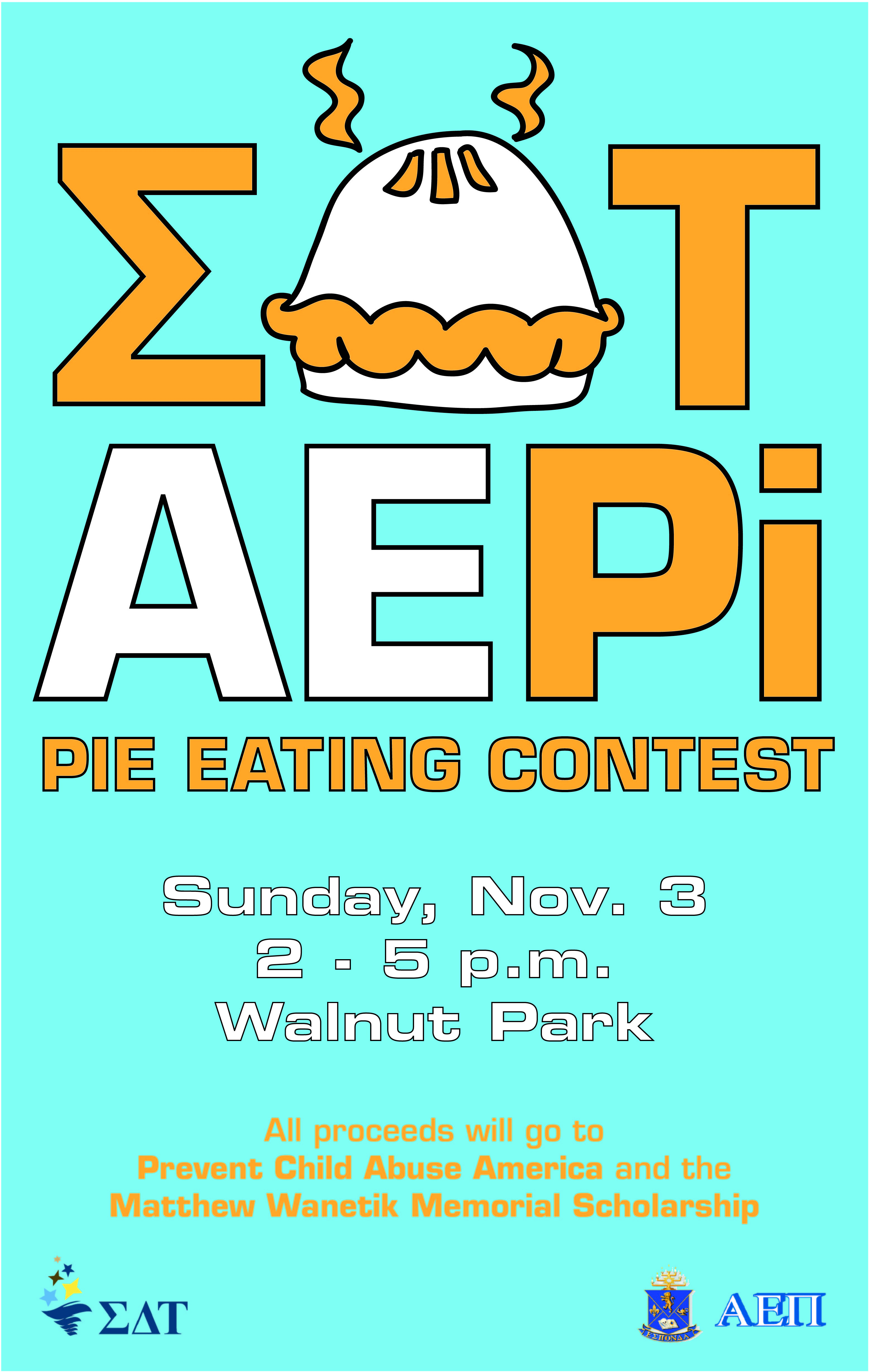
EAT PI Poster
Niko’s Greek Taverna Website Design
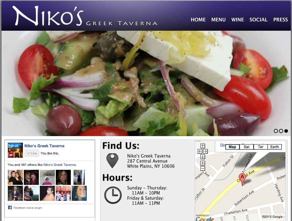
I absolutely love this website design. It’s clean, appetizing and easy to navigate. The name of the restaurant, Niko’s Greek Taverna, is right there in the top corner. Then, on the navigation bar, there lists home, menu, wine, social and press. These are all links that customers want to have access to before dining at the restaurant. Next, there is a picture flow; the screenshot is stuck on the salad photo, but there are other photos of a fish dish and people happily dining. In addition, on the home page there is a Facebook section, which allows people to “Like” the page right there and even see how many other people “Liked” the page as well. Furthermore, there is the restaurant address and hours of operation, which is super important because it is a common reason why people go to website pages in the first place. Lastly, it does not show on the screenshot here, but there are links to Niko’s Greek Taverna’s Facebook, Twitter and RSS pages.
http://www.nikostaverna.com/
Adobe Illustrator Rock Out

In order to create this artwork on Adobe Illustrator, the designer selected a horizontal document. Then, the designer took a photograph of the man singing, and inserted that photo onto the document. In order to create the shapes, the designer probably used one of two possible techniques. One, he or she used the symbols tool and dragged the loop symbols onto the document. The other option is that he or she used the arc tool to make the arcs of the loops. Next, the designer used the shape tool to make the circles. After the designer had all the symbols and shapes in the desired placement, he or she filled them in with different colors using the swatches library. Lastly, in order to create the shading in the some of the circles, the designer most likely went to ‘Recolor Artwork’ and added black or white tint.
Hamburger Ingredient Typography
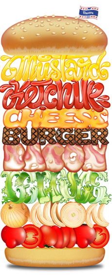
This hamburger design primarily relies on its typography. The sorts of typographic elements that make it stand out are the different typefaces that spell out the different components of the hamburger. The typeface of the each ingredient is the correct color, texture, and look of the actual ingredient itself. This allows the word to accurately resemble the ingredient that it’s representing. I think that this design is very effective.
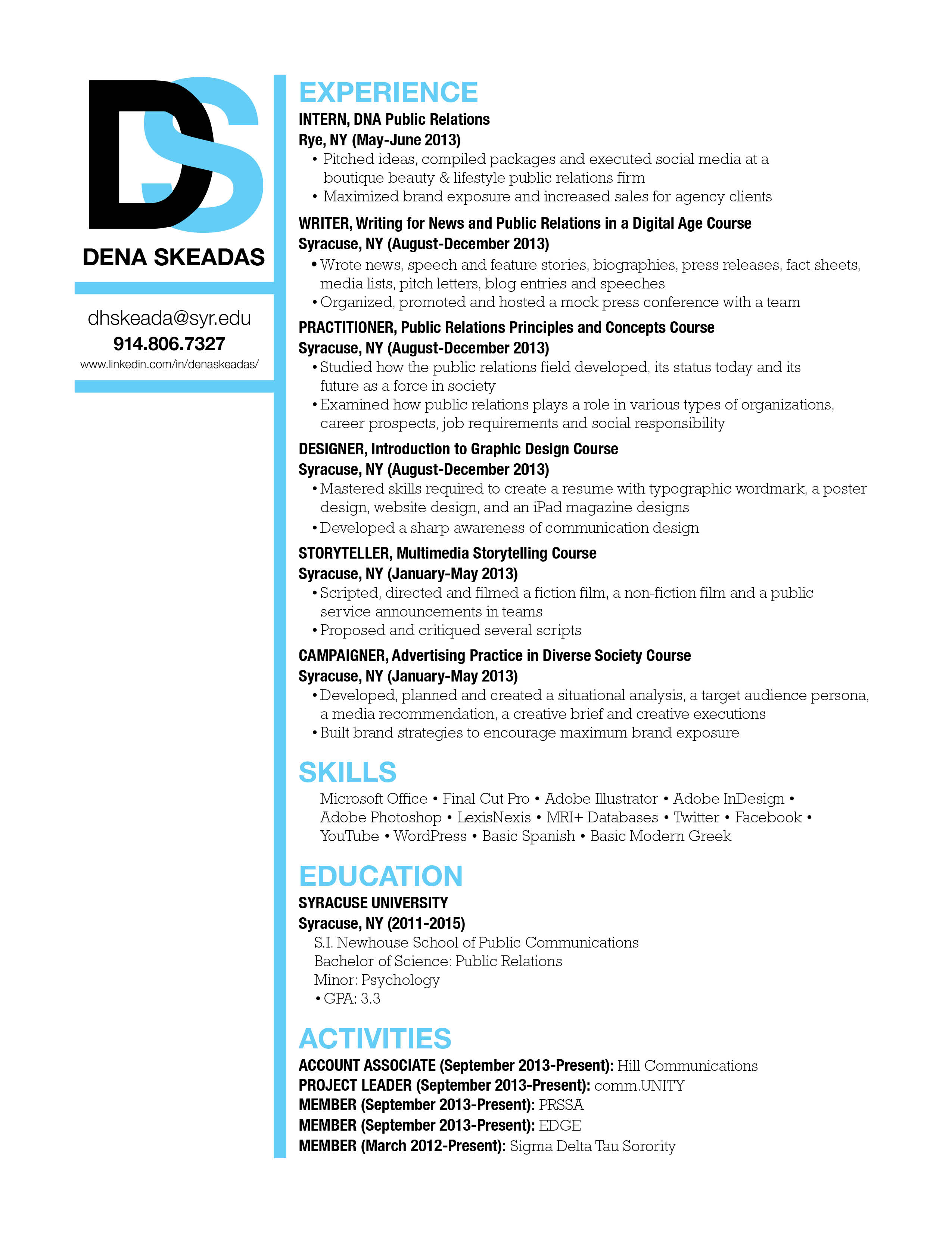
Dena Skeadas Resume
Keep Calm and Carry On Poster
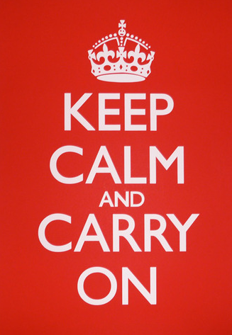
Originally, this poster was intended to increase British morale before the Second World War. Now, this poster has become even more famous. I see this poster almost everywhere, and I believe that it has a powerful message. It tells its’ viewer to not worry about what is going on, but to remain calm, and to keep moving along. Not only is its’ message very strong, but it is designed very well. The Gill Sans typography that is used remains the same throughout the entire poster. It is white, bold, and stands out very clearly in front of the bright, red background. The typography, color, and design are very clear and keep the message short and simple. I don’t believe anything should be changed to this poster to improve its effectiveness.
Niko’s Greek Taverna Wordmark
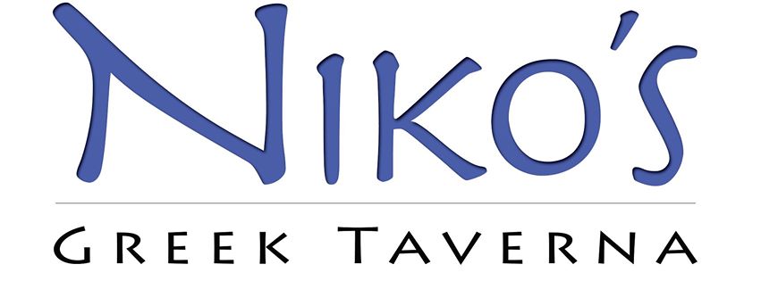
This typeface, most closely related to Aeris Pro A Bold, is very well-suited for Niko’s Greek Taverna. Being a Greek restaurant, this typeface adds a very “Greeky” feel to the wordmark, and therefore, gives the restaurant more culture that is crucial for its success in the restaurant business. Due to size and color, “Niko’s” is the main focus of the wordmark, which brings out the significance of that particular name to the restaurant. The type surely aligns with the brand identity design because the wordmark accurately portrays the feel of the restaurant.
Disney Wordmark

The fun typeface, Lettering Delights Walt, of this workmark coincides with the magical persona that Disney is renowned for. The color blue, being an inspiring color, also adds life to this wordmark. The designers made this wordmark stand out by making the shape of the typeface so distinct and unique to Disney, thus creating a memorable visual experience for the viewers.