
Author Archives: Euginie Kim
100 McDonald’s Moments
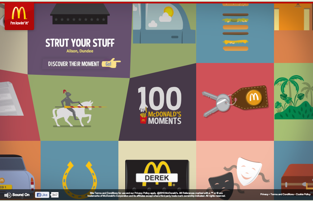
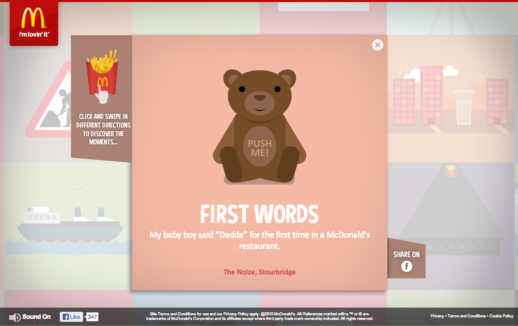
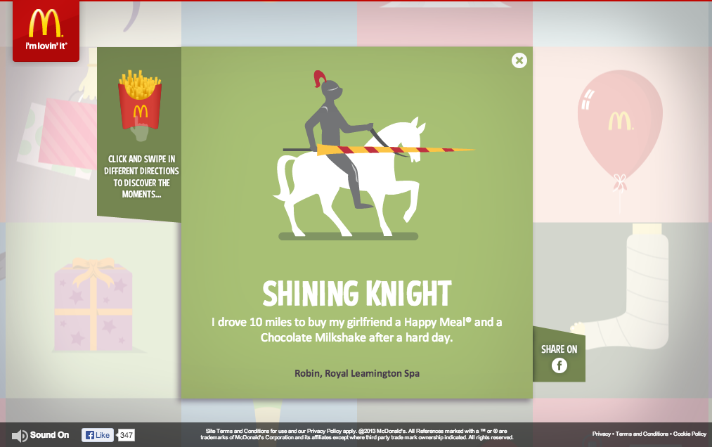 I chose 100 McDonald’s Moments as my favorite website because of its effectiveness in engaging the audience, showing brand personality, and and also enhancing brand image.
McDonald’s did a fantastic job of creating a web site that is purely created by engagements of its consumers. With the valuable anecdotes that consumers have sent, it raises the credibility and authenticity of their message to a whole new level.
Their use of color, gif motion, grid format, and typography are all fun, colorful, and original and it conveys the personality of McDonald’s excellently.
Adobe Illustrator Artwork
This is an infographic created using Adobe Illustrator. I found this infograph from a Adobe Illustrator tutorial website. This is definitely a very high-level difficulty work that requires lot of knowledge about the program to make it. However, if I were to guess what the designer have done to create this project, The first thing I can think of is setting up the three-dimension grid, based on the three dimensional rectangular platform. Also, one would have used the pen tool to create figures like houses, trees, train station, and the beach scene.
Week 4 Blog: Typography
This design solely relies on typographic to create this image of a gun. The purpose of this graphic is for public service announcement, raising awareness for the danger of texting while driving. By creating a shape of a gun through face found in regular phone while texting, it allows viewers to create the realtionship between the gun (and its associated values such as violence) and texting in the car.
Eunice Kim Resume
KONY 2012 Invisible Children Poster
The colors, bold typeface, and the eye-catching image all work to make this poster successful. The use of complementary colors attracts the viewers to be engaged with the poster. The designer chose the bold yet modern typeface to imply the importance and urgency of this issue. The boldness arouses confidence and sense of call to action to the viewers. Furthermore, the icon is very symbolic and engaging at the same time because the contour of elephant and donkey symbolizes the icons for the dominant American political parties Republican and Democratic. The crossing of these two icons in this poster implies that all parties must unify in this movement and work together for the same cause. It also shows the hierarchal importance of this issue, saying that this movement is in the higher hierarchy than the political differences of the parties, which emphasizes even higher importance of this topic. It definitely achieved its marketing goals because it was bold, attractive, clear, and distinct in its delivery. If anything could be improved in this poster, it may be to address more of the actual issue what we are dealing with. However, this itself is good enough to fulfill the purpose of their campaign .
Outback and Disney Wordmark
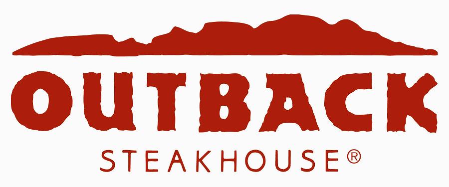
This wordmark of the famous Australian steakhouse Outback, that is now open worldwide, does a phenomenal job of portraying the brand image in the name. The crumpled and irregular typeface of “Outback” and its bold, red color gives an impression of wildness, amazon, and jungle. This is carried on through all of their branding strategies. For instance, their television commercials are usually composed of having jungle, Australia, kangaroo, and wildness as the main themes. Furthermore, the thickness of the typeface also portrays masculinity, which is well paralleled with the actual interior design of this steakhouse.
![]()
Disney’s wordmark is probably one of the most famous of all times. Disney’s target audiences are children, which means the associated values that they want their target to associate with are friendly, fun, exciting, and magical- all at the same time. It’s whimsical and curly typeface gives an impression of magical fantasy, which is exactly what they wanted to portray to the audience. . The roundedness of the typefacess gives an impression of friendliness and warmth. However, the use of the color blue allows Disney to have a balance of both masculine and feminine. If the wordmark of Disney was a feminine or warm color, they could have possibly lost their male audiences.