
Author Archives: Peggy Kanterman
A Booming Web Design
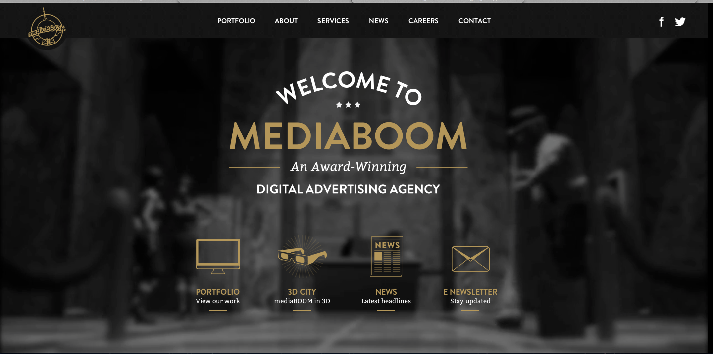
I really love this website design. The darkness of the background contrasts excellently with the white and gold colors used for the type. I also really like the way the overhead lights in the background frame the type on the page. It looks as though the lighting comes from the tabs at the top and then as it shines down and widens its scope of light, the type on the rest of the page fills up that lightened space. I also approve of the way the picture is blurred in the background; it allows the viewers eye to be focused on the clear type of the page.
I find the visual hierarchy on this website design to be very effective. My eye naturally focuses first on the largest size type of the most important word, “mediaboom.”The san-serif typeface is easily readable, and layout of the type is playful and interesting. The links with the visuals at the bottom of the page do a great job of capturing my attention. The visuals allude to the information that will be described on the different pages, and they are neatly organized at the bottom of the page. Overall, I feel this website design is organized and visually appealing.
Illustrator Inception
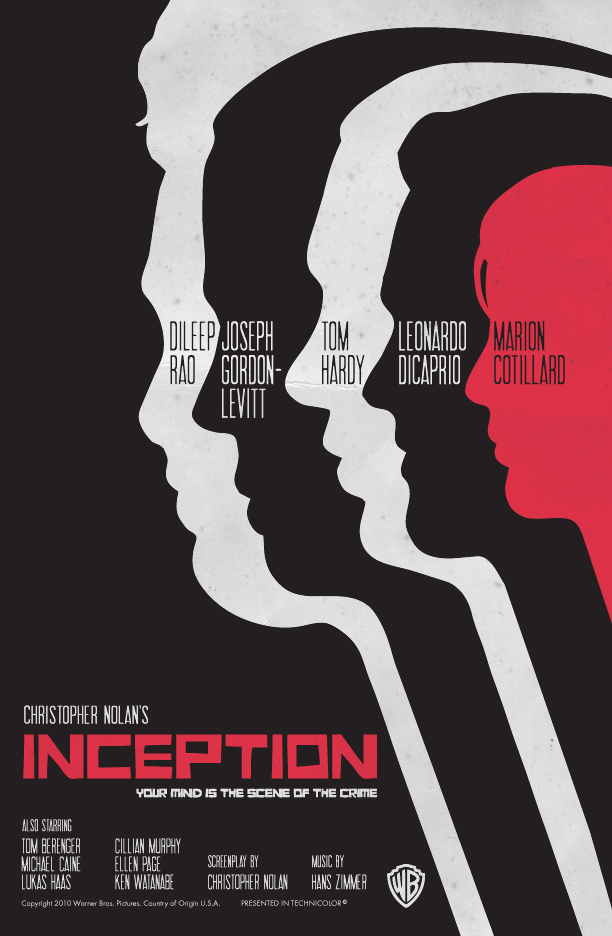
This poster is a simple design that is really effective for the movie Inception. The visual uses the pen tool, the direct select arrow, and the color bucket in the creation of these figures. If I were to produce a similar illustration, I would draw one of the figures with the pen tool, and then I would make duplicates of the figure. Next, I would use the direct select arrow on each duplicate to change the hairline a bit, and the paint bucket to change the color. This poster is simply designed yet it is clever and creative.
Apple Blog 4
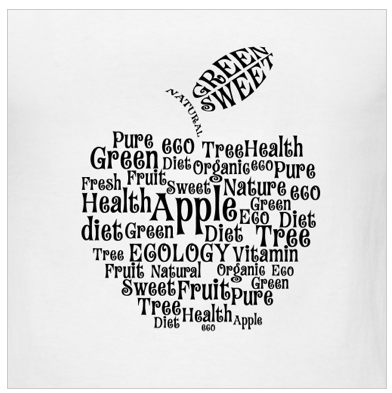
I really like the typography, arrangement and spacing on this t-shirt design. I like the way that the words make the shape of an apple. The word apple is the biggest in size and stands out the most, which makes sense because all the other words describe aspects of apples. The typography works really well on this design because the curly letters add to the element of the curved outside lines of the apple. Overall, the typography is fun and the arrangement of words is clever.
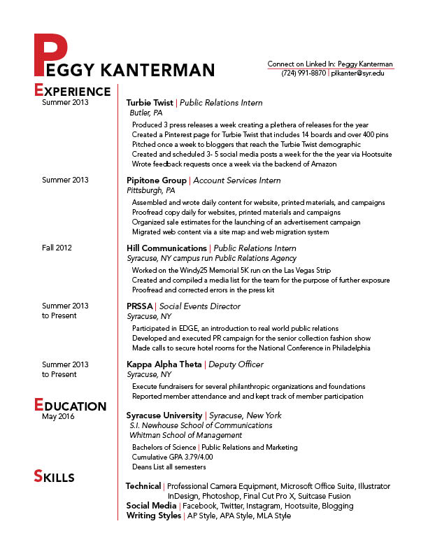
Peggy Kanterman Resume
Sushi/Plastic Pollution Poster
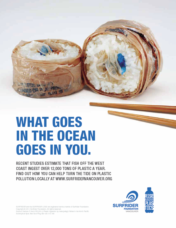
The major message this poster tries to convey is that polluting the ocean with garbage should be prevented because fish eat that garbage and we eat fish. I believe the designer decided to use this sans-serif typography because it is easy to read on a poster-sized paper, and the message is straight to the point. I also believe the designer used the color blue for the typeface to represent the blue of the ocean. The visual choices made were very clever. The picture is two pieces of sushi with a pair of chopsticks like it is ready to be eaten. The issue with these pieces of sushi is that the outside is wrapped in plastic, and the inside, where the raw fish is usually placed, contains more plastic remnants. The words connect very intimately with the graphic image because the words say that we eat fish and if fish ate plastic pollution we are essentially eating plastic. The picture shows exactly what the words are saying by showing plastic on and in the sushi pieces where food from the ocean usually is in sushi pieces. The poster met marketing goals by grabbing the attention of readers with an interesting visual, while having a bold, easy to read, and straight to the point message. It makes for a clever yet easy to comprehend poster. There is always room for possible improvements. I think that maybe the words could have been written on a path of a wave to drive home the ocean message even further. Additionally, one of the chopsticks could have pointed down toward the text to encourage the reader’s eye to read the message. Lastly, the logos in the bottom right could be smaller because the size they are now is a little distracting from the overall message.
Cool Whip Word Mark
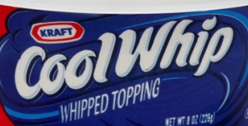
The typeface Cool Whip uses, which resembles Gans Antigua Gold, is a fun and effective wordmark. The letters look like the the topping when it is scooped out of the container. The color white also represents the contents inside the package, which is excellent brand identity. The characteristics of the word mark such as the typeface, color and arc gives an air of lightness and fun. It creates a memorable visual due to the quirkiness of the serifs and the tight kerning of the letters. The brand identity is also incredibly strong because when you look at the wordmark you are immediately reminded of the contents within the package and how tasty it is to eat.
CNN Word Mark
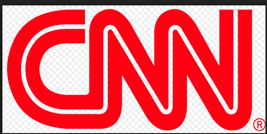
The CNN wordmark strikes me as particularly interesting and effective. The warm red color comes forward and catches the eye. The color gives a sense of urgency like a stop sign as if to say “Stop here and listen to the news.” The wide sans-serif typeface is attention-getting yet simple and will easily jump out when flipping through the television channels or while searching stories on the web. The white line running through and connecting all the letters is also very defining. It makes the words flow and reminds me of a path like the way news travels. The connection and flow of the words also remind me of the way we are all connected to the news and general happenings of the world. All these aspects of the wordmark represent the brand identity well for CNN. It is eye catching yet still sends the message that CNN is a news outlet.