I honestly don’t even know where to begin with I learned in this class. To begin, I was able to host up my resume from being just a simple and boring Resume to one that looks so awesome and stands out from a normal one. I’ve learned what typefaces work well depending on the project. I also learned that black backgrounds for everything really isn’t such a good choice. Alignment and Hierarchy is key in every design.
Mexican Prints and the Taller De Grafica Popular
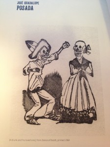
Although I am not very familiar with Mexican culture, the exhibition did give me an unforgettable experience. This exhibition shows the influential graphic work of the artists that shaped 20th century Mexican art. The works are all about revolutions and wars, some are realistic while some are satirical.
The works created by Jose Guadalupe Posada are one of the most impressive. The whole series of this image is consisted by several small cartoon illustrations. Because the images are small, when I first saw them I just thought those images were so cute. However, all “cute people” are skeleton, which shows satirical acuteness and political engagement. Posada was the cartoonist illustrator and artist whose work has influenced many Latin American artists and cartoonists.
Lessons learned in GRA 217
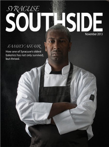
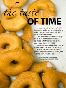
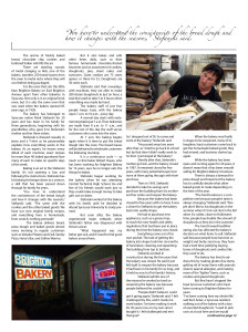
Having previously worked for a number of publications in the past, I had a meager knowledge of graphic design mainly with regards to the adobe programs we used. However, I had no idea how many principles of visual hierarchy and gestalt and color and type went into creating a single visual out of multiple components. This class enabled me to refine my already established skills into a more professional level… Though I still have a long way to go to be considered a professional.
What I learned in Graphic Design
I knew nothing about graphic design before taking this class. Now, I know the core principles and am able to recognize how apply them when I work on a project. I also know more about fonts than I ever thought I would in my entire life.
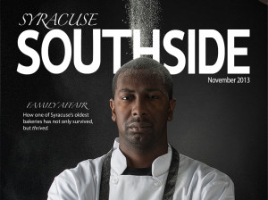
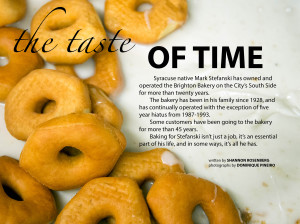
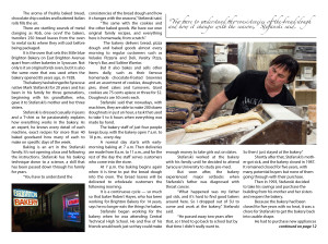
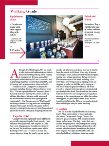
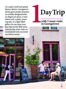
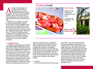
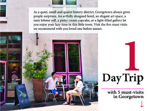
Ipad Mag Floating Redo
Ipad Floating Redo
What I have learned
The most useful things I have learned from this class are how to use InDesign, Illustrator and Photoshop. Although I am not very satisfied with all projects I have done, I really appreciate that I have my own profile right now as a communication people. I also can do many poster and image editing right now for my own interests and for my internship. In addition, this class gave me a great amount of knowledge about graphic designs and opened a new field for me. It is very interesting that I often think about typefaces, visual hierarchy, colors and etc when I see somethings on the street right now. Overall, this class is one of the most interesting and useful classes I have taken in SU!
What I learned this semester
I had a very good time getting to know the formal principles of design and especially the typeface families. I never knew so much went into all the little details. I learned to appreciate the print content that is out there. After taking this course I understand better the value of design in communicating messages. One thing I notice in my everyday life is that magazines seem worth the money to buy now that I know how much goes into making the product. I’ll miss a lot of the faces from this class. Good luck, God speed, cheers. Merry Christmas.
What I have learned…
This semester really opened my eyes to the amount of time and effort that goes into creating all the visual aspects of this world. I have really enjoyed learning about what grabs peoples attention, how to use colors, layouts, lines and photos effectively, and overall, just how to create a clean and well designed product. It has been nice to have a new level of creative freedom that is not given with a lot of classes. Its also been an interesting challenge to continue being innovative and think of new ways of presenting things. I think this class has taught me an enormous amount over the past 15 weeks and will hold me in good stead as I continue to develop my skills and abilities.

