FURI KURI

9368070035_61c8b83fe2_o

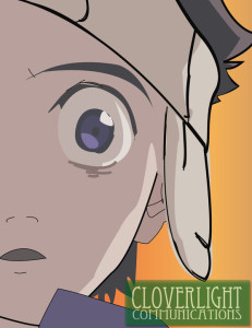
So whats is FLCL? Fooly Cooly, furi kuri, a weird dance made up in the Gundam series… Well no one knows, and I guess its better that we don’t get into that tonight. So here we have a vector work of the show’s main character, Ta. As you can guess the artist was some pompous jerk that was trying to be abstract with the design. Really dude, its only half of a face and I am supposed to feel some sort of emotion from this…..

Well, Like every post. I digress. The artist used Adobe Illustrator so that he could use the artwork in any size. Using the pen-tool he made each section separately in various layers. IE hat, mouth, eyes. He used the sloppy style to give a sorta pastel effect. Very nicely executed, but I would still call the artist a jerk….If I ever met him,.

 

harper_poster

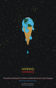
I think the adobe tools used in this poster design would be the pen tool. a lot of the design can easily be manipulated by the free transform tool that allows the person to change the curves of each like and size, etc. i love the effect of the earth melting as if it were ice cream.

Save the Earth–Illustrator Tools

Screen Shot 2013-09-25 at 7.42.08 PM

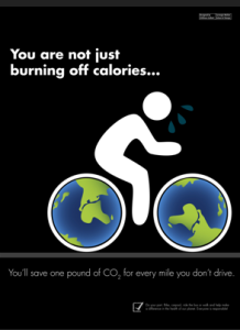
This poster is very realistic and it’s successful in getting the message across to the audience. It appears to be done in illustrator, filling in the bike tires with the earth-drawn pattern, and the use of the pen tool to create the figure on the bike. If I were to replicate this poster, I would likely use the pen tool, draw two ellipses (using shift to make a perfect circle) and then increase stroke sizes for the tire rims to show the black, finally filling in the circles with the earth pattern created.

Michael Jordan

font-typography-design-30

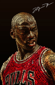
What I love about this poster isn’t just that it is of the best basketball player of all-time, but the typography tell us the story. First off, this font is perfect for this design because of its perfect mix between legibility and attention-grabbing attributes. By his right jaw you can easily see “Domination” and on his forehead you can easily see “MVP”. A photo of Michael Jordan looking fierce is great to see, but the typography adds another historical and inspirational boast to it.

Typography_by_DamagedInnocence


Dictated, but not read.

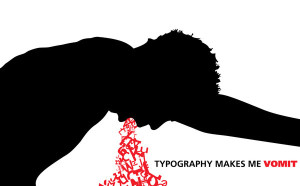
Typography is interesting good typography can really shock something out, but the bad version, can really make you think “what the hell were they thinking?”, but as I’ve learned this week, black layers on white paper is only a fraction of typography. There are bold elements that we can use, like a vibrant red to express the point. I just want to really comment on the fact that when typography is good it’s really good, but when it’s bad it can look like, as Professor Golden would say “total crap”. So simply less is more in typography.

I prefer to use simple statements in my typography. So personally I am fond of the impact font. For my style and designing I generally lean towards white impact fonts on top of full color images. It gives the impression of a stamp on a photo sort of like the stamp of rejection or approval.

Sincerely,

The Office of Torrey Lee

Typecycle

Bike

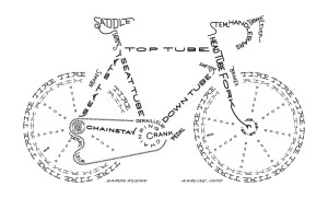
I really like this image of a bike built using typography because not only does the name of each part create that part of the picture, but also because of the way certain letters in key positions are styled to better fit the shape of the part it represents.

Typography.

Print

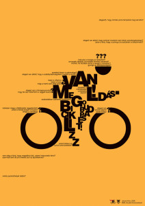
This poster cleverly uses typography to give the essence of motion. I like how it is a recognizable figure yet still abstract. It effectively uses the type’s size to create form, especially the very small type to invoke speed. The design is simple and has nice contrast against the yellow background.The giant “O’s” as wheels draw the viewers eyes in but do not distract from the whole image over all.

Week 4 Typography

I think this really demonstrates how typography can really drive home a message or theme. I think it’s really interesting how words alone from this image. The words are describing challenges faced in President Obama’s administration, and the image depicted shows the burden of leadership. I think this is a creative way to show how typography can be really powerful when different elements are combined.

01-extremely-awesome-typography