Typography Post: Week 4

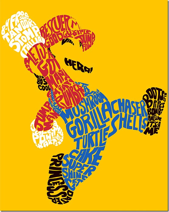
.I like the design of this using typography because it never says in any of the words what the design actually is. Everyone knows that it’s the super hero character Mario. It does have a lot of words and catchphrases that are related to the Mario franchist, such as “it’s a me!” and “Mama Mia!” and “princess” (which refers to Princess Peach. I know that distortion is a giant no-no in most typography, but it definitely works in the designers favor in this instance. I also think that without coloring in Mario’s shirt and overalls, and the design was all black, it might have been harder to pick up on the fact that this design was indeed Mario the plumber. So, the elements of the design that I like are the distortion and the coloring.

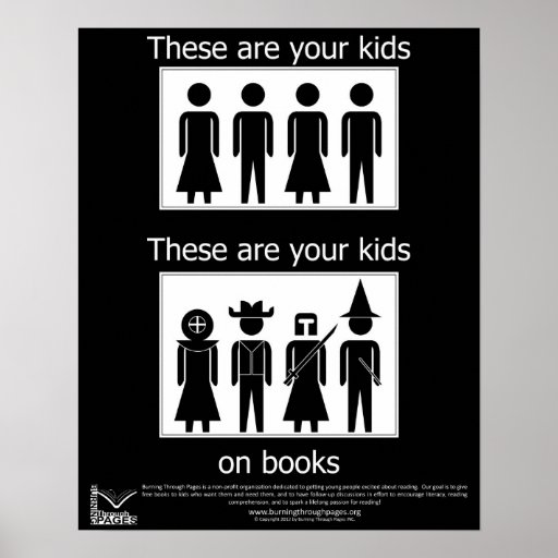
I like the design of this poster because it is straightforward and to the point. There is no elaborate typography or coloring to convey a message. Instead, the designer of this poster decided to use basic images to convey the message that reading is fun and makes children use their imaginations. Therefore, parents should encourage their children to read more.

I think this poster in particular drives home the point that graphic design doesn’t always have to consist of elaborate typography with gradient coloring and fantastic pictures. Sometimes the simpler the design is, the better and more effective it is. I don’t feel that here’s any need for improvement with this poster because it hits the nail on the head upon first glance – reading is fun; reading is engaging; kids should read more. The design and the message are so clear that children and adults alike can understand it.