Illustrator Drawing

image


What intrigues me about this image is it’s simplicity, but it’s ability to still send a concise and direct message. I can imagine that this image was made simply by tracing over an image of Darth Vader with paper and pencil and scanning it into Adone Illustrator. Then using the pen tool, the artist can easily draw over the image and add the additional details to Darth Vader’s face. Once the image is complete, it would simply be a matter of chanjng the pen’s color to grey and adding whatever text is needed at the bottom. The logo could simply be added by drawing it with the pen tool in a grey color scheme. With those simple tools, the image is completed and sends a clean, concise message.


Poster Blog Post

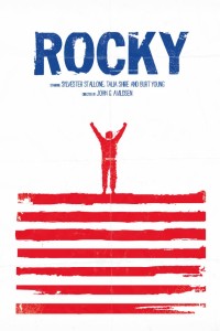
ROCKY POSTER


My infatuation with this poster comes from it’s creative use of white space to attract the viewer’s eye to the important information and imagery on poster. Firstly, the text is one color which makes it easier for the audience to read and understand what the poster is about. Secondly, the artist plays with two colors (red and white) to create the actual picture within, and makes a symbolic image of “Rocky” the boxer at the top of a set of steps; reminiscent of a critical moment in Rocky’s training in the film. And finally, the artist specifically used the color combination of red, white, and blue to convey the message that the movie is about an “all-american” boxer fighting to win something.

Wordmark

SUPREME WORDMARK

Supreme is a leading brand in the street-wear industry and is popular among a varied range of demographics. Many would argue that this is a result of their use of simplicity in their designs, and this is perfectly exemplified in their primary Wordmark. What I like about the simplicity of the Wordmark is that it doesn’t just strive to be simple, it emphasizes the word “Supreme” by doing so. It’s saying, “instead of cluttering up the word with fancy blots and scripts, let’s just allow the word speak for itself,” and it does. I can also appreciate the fact they decided to not just write the word in a nice front, but almost cut the word out of the red square so that the red color makes the word more pronounced.

BLACK SCALE WORDMARK

Black Scale is another well-known street-attire brand and has a very unique style. In their clothing, they make an effort to be dark and give their designs a kind of “classic” feel; this is also especially represented in their Wordmark. The plain, serif text accomplishes the “classic” feel to the brand and is further amplified by the script writing in the background. To add to the distinctiveness of the brand, turning the “A’s” into “V’s” was a clever decision and further contributed to the sharpness and feel of the Wordmark. Not to mention, they attempted to stay in a darker range of colors when making their design.