Author Archives: Nora Horvath
Poster Critique
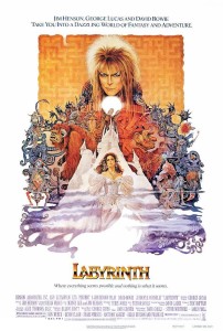
The poster I chose to critique is the movie poster from Jim Henson’s Labyrinth. This poster is well designed because it effectively conveys a lot of information about the movie: The design of the labyrinth in the background, Jareth on top demonstrates that he’s the one in power, the complexity/overlapping of the creatures exemplifies the tagline, which is “where anything seems possible and nothing is what it seems.” I think the text that was chosen is appropriate to the film. It’s a novelty type, but the use of all capital letters and the brassy ombre fits in with the aesthetic of the rest of the images.
Wordmarks
The sharpie wordmark is effective because the font looks like stroke of a sharpie marker/pen. The designer also chose to use only black because the traditional sharpie marker was black. The loose cursive writing also makes the word look handwritten. The font that is used is also easy to read and unique so it makes it easier for the consumer to recognize it.
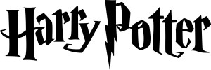
The harry potter wordmark goes along with the aesthetics of the entire movie. The font’s jagged footings make it seem as though it could have been written using a quill, and the “p” has a lightening bolt, just like Harry does. The uneven quality to the letters with the jagged edges also makes the font look spooky.


